Introduction
The unusually-named brand Wasabi Mango comes out
of Korea, offering a range of low cost monitor options to rival those offered by
the likes of Yamakasi, QNIX and Achieva. We've not really heard much about
Wasabi Mango before, but were approached by them about conducting a review of
their 27" QHD275 Universal display (referred to throughout this review simply as
the QHD275 for ease). It's based around an IPS panel, offering a 2560 x 1440
resolution, decent spec and good connectivity options - all at a nice low cost. We've not been very impressed
with most of the Korean displays we've tested over the years so we are
interested to see if Wasabi Mango can offer anything different here.
If you appreciate the review
and enjoy reading and like our work, we would welcome a
donation
to the site to help us continue to make quality and detailed reviews for you.
Specifications and Features
The following table gives detailed information
about the specs of the screen:
|
Monitor
Specifications |
|
Size |
27"WS (68.47 cm) |
Panel Coating |
Light AG coating |
|
Aspect Ratio |
16:9 |
Interfaces |
1x DisplayPort 1.2
2x HDMI
1x DL-DVI
|
|
Resolution |
2560 x 1440 |
|
Pixel Pitch |
0.233 mm |
Design
colour |
Glossy black bezel and base |
|
Response Time |
6ms G2G |
Ergonomics |
Tilt only |
|
Static Contrast Ratio |
1000:1 |
|
Dynamic Contrast Ratio |
50 million:1 |
VESA Compatible |
Yes 100mm |
|
Brightness |
380 cd/m2 |
Accessories |
Power cable and brick, DL-DVI and audio
cables, remote control |
|
Viewing Angles |
178 / 178 |
|
Panel Technology |
LG.Display IPS |
Weight |
not
listed |
|
Backlight Technology |
W-LED |
Physical Dimensions |
not listed |
|
Colour Depth |
16.78m (8-bit) |
|
Refresh Rate |
60Hz |
Special
Features |
2x
2W speakers, headphone socket, audio in connection, remote control, PiP /
PbP |
|
Colour Gamut |
Standard gamut
~sRGB |
The QHD275 offers a decent range of connectivity
options with DisplayPort, 2x HDMI and Dual-link DVI
provided. The digital interfaces are HDCP certified for encrypted content and
the video cables are provided in the box for DL-DVI only. Good to see a range of
connectivity options offered here considering the low retail price of the
display and the fact a lot of screens tend to limit themselves in this area when
cutting costs.
The screen has an external power supply brick
which is provided of course. There are some basic 2x 2W stereo speakers
included, an audio input and headphone output connection, and even a remote
control. There aren't any USB ports on this model, or other extras like ambient
light sensors or motion sensors.
Below is a summary of the features and connections
of the screen:
|
Feature |
Yes / No |
Feature |
Yes / No |
|
Tilt adjust |
 |
DVI |
|
|
Height adjust |
 |
HDMI |
|
|
Swivel adjust |
|
D-sub |
|
|
Rotate adjust |
|
DisplayPort |
|
|
VESA compliant |
|
Component |
|
|
USB 2.0 Ports |
|
Composite |
|
|
USB 3.0 Ports |
|
Audio connection |
|
|
Card Reader |
|
HDCP Support |
|
|
Ambient Light Sensor |
|
MHL Support |
|
|
Human Motion Sensor |
|
Integrated Speakers |
|
|
Touch Screen |
|
PiP / PbP |
|
|
Factory Calibration |
|
Blur Reduction Mode |
|
|
Hardware calibration |
|
G-Sync |
|
|
Uniformity correction |
|
FreeSync |
|
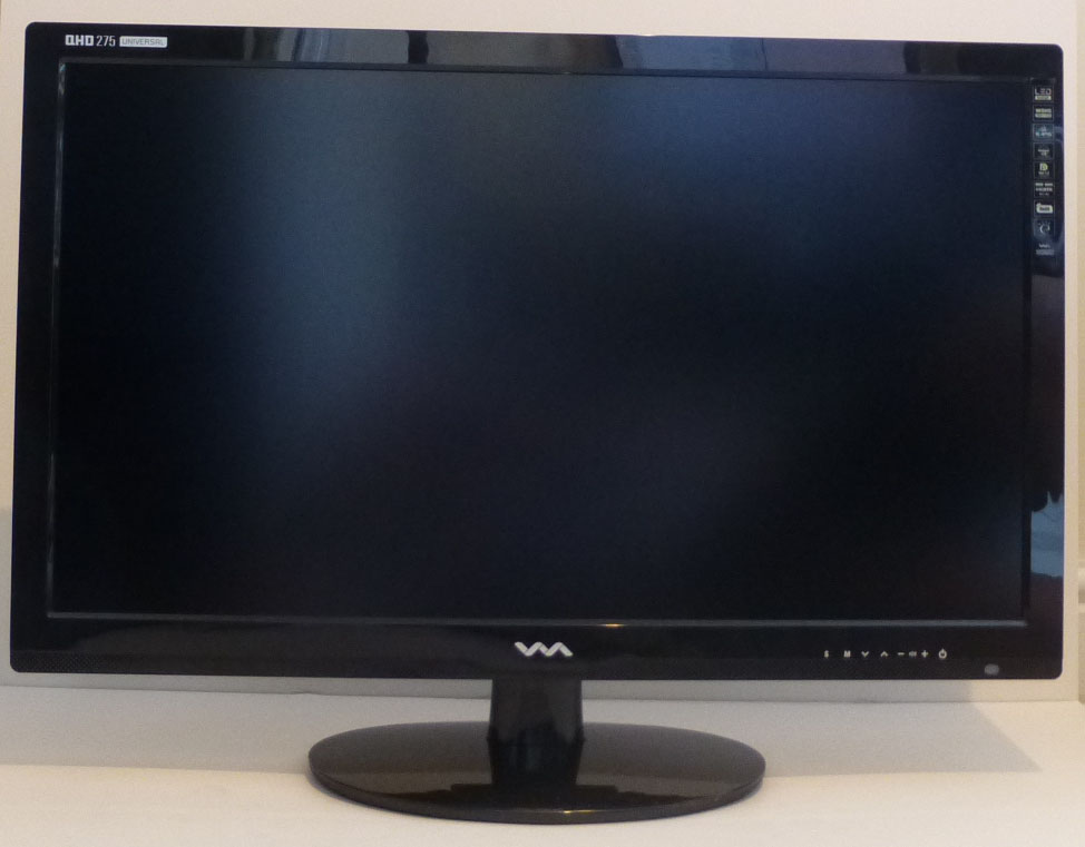
Design and Ergonomics
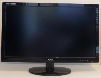
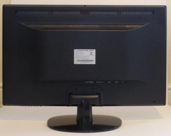
Above: front
and rear views of the screen. Click for larger versions
The QHD275 comes in an all black design with
glossy plastics used for the front bezel, stand and base. The bezel
measures ~25mm along the top and sides, and ~38mm along the bottom edge.
It is fairly chunky as a result. There is a Wasabi Mango logo in the
middle of the bottom bezel and the "QHD275 Universal" product name in the
top left hand corner as you can see from the photo above. The sticker
carrying various logos for things on the right hand edge can be removed if
you want. The OSD control
labels are also on the front of the screen as you can see, in the bottom
right hand corner.
The back of the screen is finished in a
matte black plastic. The stand attaches at the bottom of the screen but
can be removed if you want. VESA 100 mounting holes are provided on the
back of the screen for more versatile arm- and wall-mounting options. This
might be useful considering the ergonomics here are very limited.
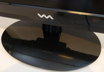
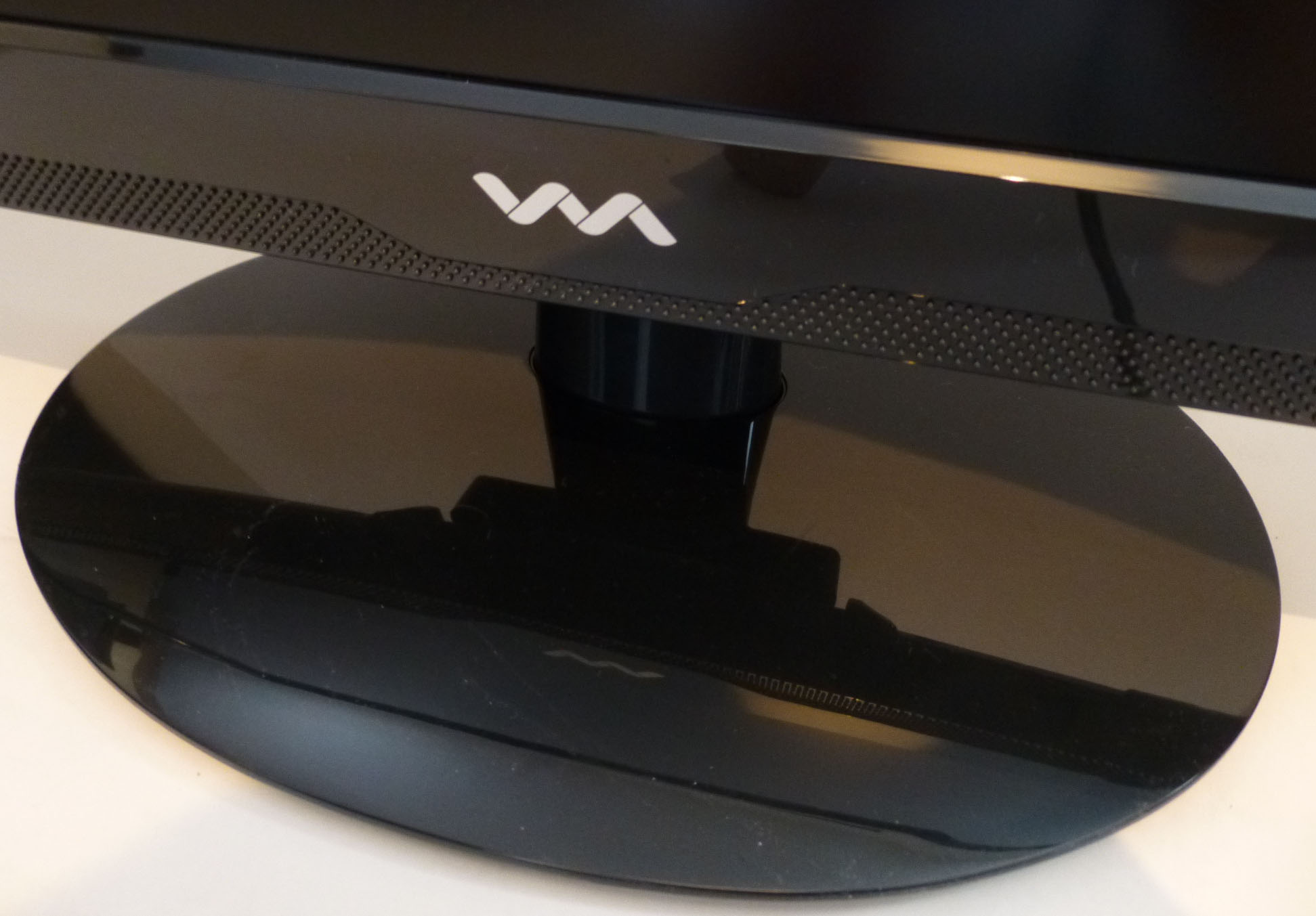
Above:
front and rear views of the stand and base. Click for larger versions
The oval shaped base is a glossy black
plastic as well. Since the monitor arm attaches at the bottom of the screen on the
back, it does mean the screen can be pretty wobbly with even a slight
knock.

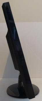
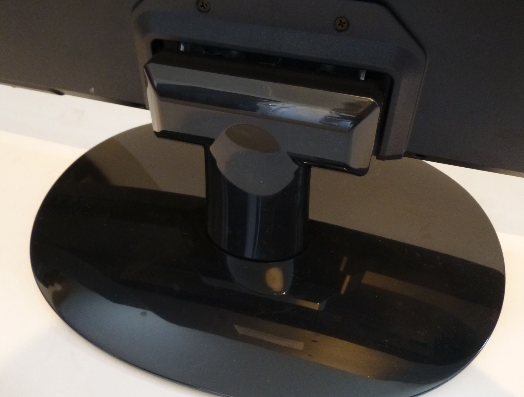
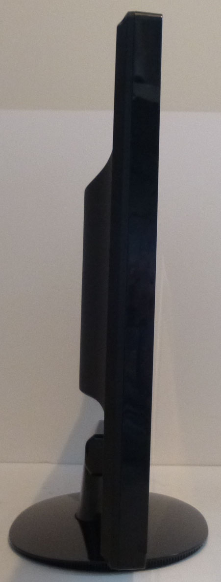
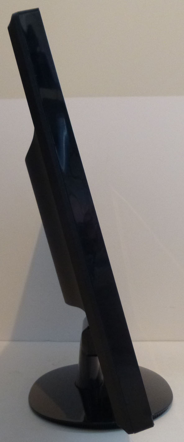
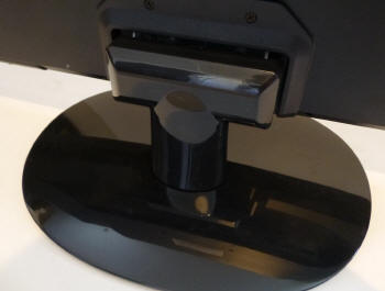
Above: full
tilt adjustment range shown. Click for larger versions
The stand provides only a basic tilt
adjustment as shown above. The range of the tilt is reasonable, although
it's stiff to operate. Again, since the stand attaches at the bottom of
the screen on the back, it's a bit unstable as you re-position the angle.
Sadly the stand is very limited as there is no height, swivel or rotate
adjustment offered here. When the screen is vertical, the bottom edge is
~65mm from the edge of the desk.
A summary of the screens ergonomic adjustments
is shown below:
|
Function |
Range |
Smoothness |
Ease of Use |
|
Tilt |
Yes |
Smooth |
Stiff |
|
Height |
n/a |
- |
- |
|
Swivel |
n/a |
- |
- |
|
Rotate |
n/a |
- |
- |
|
Overall |
Limited range of adjustments
offered |
The materials were of a moderate standard
although the whole screen did feel a bit basic and low-cost if we're honest.
Probably to be expected given the low retail cost. There was no audible noise from the screen,
even when conducting specific tests which can often identify buzzing issues.
The whole screen remained reasonably cool during prolonged use.
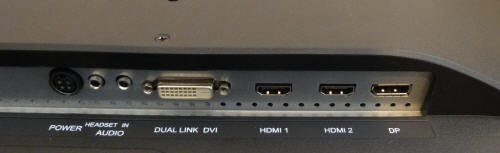
Above:
interface connections on the back of the screen. Click for larger version
The back of the screen features all the
connections. There is the power input (external brick needed), headphone out,
audio in, Dual-link DVI, 2x HDMI and DisplayPort as shown.
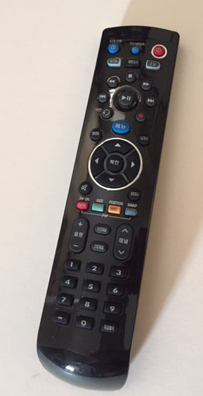
Above:
remote control provided
A remote control is provided with the screen
which might be useful for those wanting to use it for external devices,
Blu-ray players etc. Although much of the functionality is meaningless really
as there aren't a whole lot of things you can control on the screen itself
other than maybe the brightness and volume settings. The remote is also in
Korean as you can see, although a paper diagram explaining what each button
would do is provided in the box too in English.
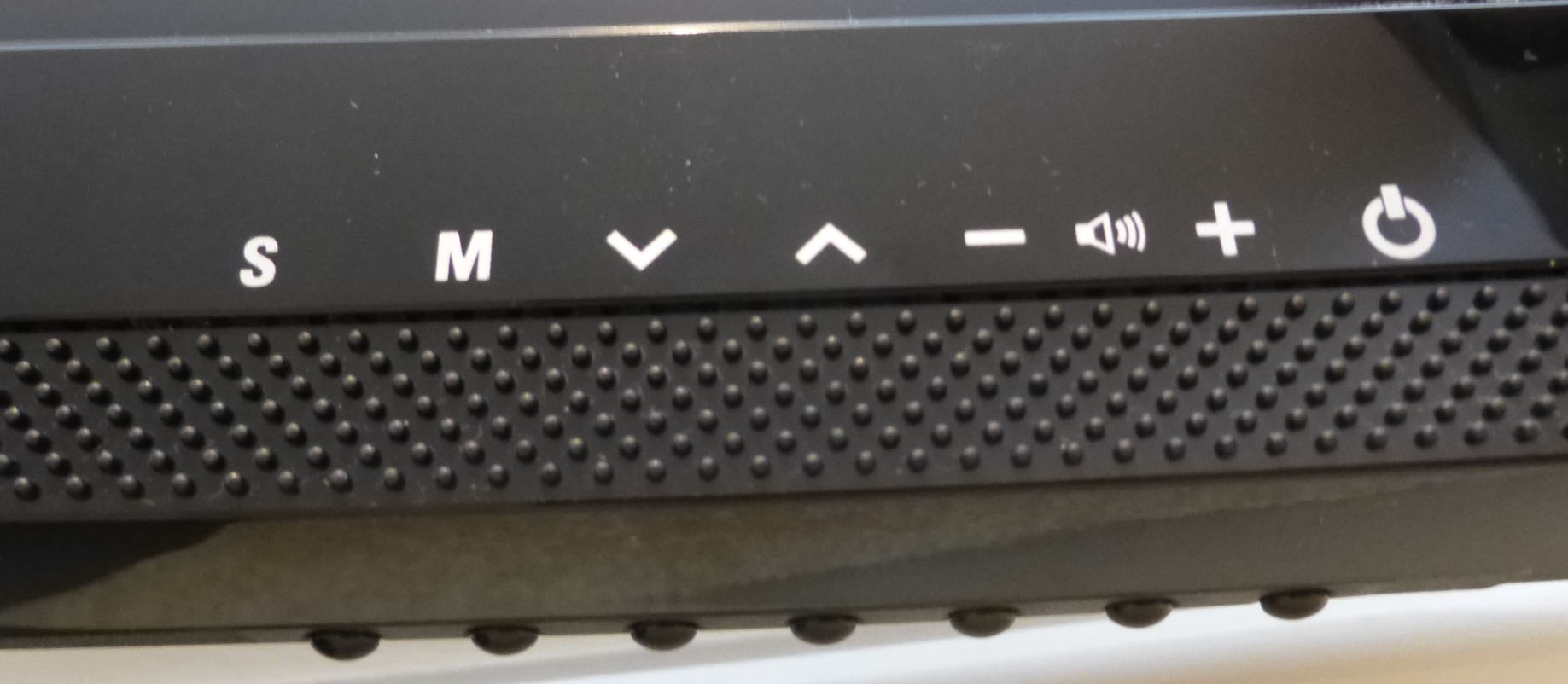
OSD Menu
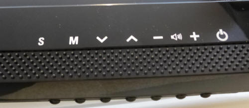
Above: OSD control buttons
on the bottom edge of the screen. Click for larger version
The OSD menu is accessed and controlled through a
series 6 pressable buttons located on the underside of the screen, in the bottom
right hand corner. The above photo is taken from an angle below to show you the
actual physical buttons, and you will see the labels are located on the front of
the bezel. Finding the relevant button was a little tricky sometimes as it was
not always obvious which one you were pressing, as the labels are quite a long
way away from the buttons, which are completely out of sight as well. To the
right is the power on/off button as well.
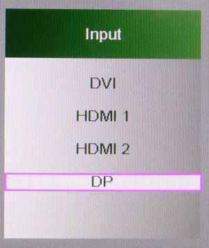
Pressing the "S" button brings up a quick access
selection of the video inputs.
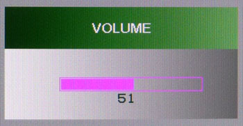
The - and + buttons bring up quick access to the
volume control for the integrated speakers.
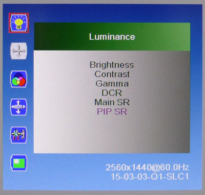
The 'M' button gives you access to the main OSD
menu, which is split in to 6 sections down the left hand side. The options
available in each section are then shown on the right. The first section is the
so-called "luminance" section, with options for brightness, contrast etc
available. You can control gamma on/off here and the dynamic contrast ratio as
well. You can also specify the source for the PiP options which is a little odd
for the "luminance" section.
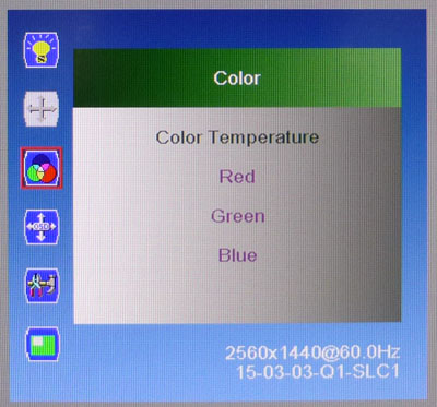
The second section is not shown in the pictures
here as it seems to be related to controlling analogue input signals, which
aren't actually available on this model. Must be a hangover from the OSD
software from versions of the screen with a D-sub input. Instead, above is the
third section for the 'color' menu. You can control a range of preset colour
temperature modes here as well as enter a 'user' mode which then allows you to
manually change the RGB levels listed.
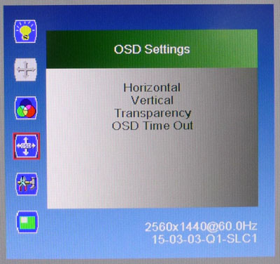
The fourth section allows you to control the OSD
menu software itself.
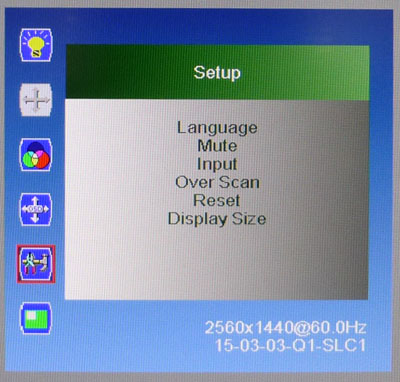
The fifth section allows you to change a few other
features, most usefully the 'display size' which is the hardware aspect ratio
control option. There are only options for full and 4:3 provided though.
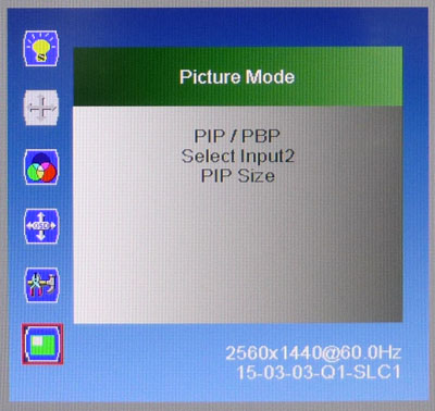
The final sixth section gives you access to some
settings related to the Picture In Picture and Picture By Picture options.
The menu itself was fairly easy to navigate
although you do find you sometimes press the wrong button because of their
location on the underside of the screen. There were a reasonable range of
options to play with, although the screen is lacking any preset modes and
control over the overdrive impulse which would have been useful.
Power Consumption
In terms of power consumption the we couldn't find
any manufacturer specified figures. We carried out our normal tests to
establish its power consumption ourselves.
|
 |
|
State and Brightness
Setting |
Manufacturer Spec (W) |
Measured Power Usage
(W) |
|
Default (50%) |
- |
39.5 |
|
Calibrated (50%) |
- |
39.5 |
|
Maximum Brightness (100%) |
- |
47.1 |
|
Minimum Brightness (0%) |
- |
29.2 |
|
Standby |
- |
5.6 |
|
We tested this ourselves and found that out of the
box the screen used 39.5W at the default 50% brightness setting. In standby it
used a comparatively high 5.6W, while most screens are <1W. Calibrated settings
were a bit odd on this screen due to the way the brightness control operates.
See the following sections of the review for more information. We have plotted
these results below compared with other screens we have tested:
Panel and Backlighting
|
Panel Manufacturer |
LG.Display |
Colour Palette |
16.7 million |
|
Panel Technology |
IPS |
Colour Depth |
8-bit |
|
Panel Module |
LM270WQ1-SLB1 |
Colour space |
Standard gamut |
|
Backlighting Type |
W-LED |
Colour space coverage (%) |
82% NTSC, 80.4% Adobe RGB, 100% sRGB |
Panel Part and Colour Depth
The screen features an
LG.Display LM270WQ1-SLB1 IPS panel which is capable of producing 16.7 million colours.
The panel offers an 8-bit colour depth and
the part is confirmed when
dismantling the screen as shown below.
Screen
Coating
The
screen coating is a light anti-glare (AG) offering. It isn't a
semi-glossy coating, but it is light as seen on other modern IPS type panels. Thankfully it
isn't a heavily grainy coating like some old IPS panels feature. It retains its anti-glare properties to avoid too many
unwanted reflections of a full glossy coating, but does not produce an too
grainy or dirty an image that some thicker AG coatings can. There were some
slight cross-hatching patterns visible on the coating if you looked very
closely.
Backlight Type and Colour Gamut
The screen uses a White-LED (W-LED) backlight unit
which has become very popular in today's market. This helps reduce power
consumption compared with older CCFL backlight units and brings about some
environmental benefits as well. The W-LED unit offers a standard colour gamut
which is approximately equal to the sRGB colour space.
Studying the detailed panel spec sheet confirms colour space coverage of 82%
NTSC, 80.4% Adobe RGB and 100% sRGB. Anyone wanting to work with wider colour spaces would need to consider wide
gamut CCFL screens or the newer range of GB-r-LED type displays available
now. If
you want to read more about colour spaces and gamut then please have a read of
our
detailed article.
Backlight
Dimming and Flicker
We tested the screen to establish the methods used
to control backlight dimming. Our in depth article talks in more details about a
common method used for this which is called
Pulse Width Modulation (PWM). This in itself gives cause for concern to some
users who have experienced eye strain, headaches and other symptoms as a result
of the flickering backlight caused by this technology. We use a photosensor +
oscilloscope system to measure backlight dimming control
with a high level of accuracy and ease. These tests allow us to establish
1) Whether PWM is being used to control the
backlight
2) The frequency and other characteristics at which this operates, if it is used
3) Whether a flicker may be introduced or potentially noticeable at certain
settings
If PWM is used for backlight dimming, the higher
the frequency, the less likely you are to see artefacts and flicker. The duty
cycle (the time for which the backlight is on) is also important and the shorter
the duty cycle, the more potential there is that you may see flicker. The other
factor which can influence flicker is the amplitude of the PWM, measuring the
difference in brightness output between the 'on' and 'off' states. Please
remember that not every user would notice a flicker from a backlight using PWM,
but it is something to be wary of. It is also a hard thing to quantify as it is
very subjective when talking about whether a user may or may not experience the
side effects.
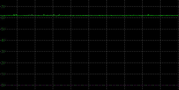
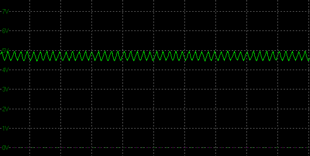
100% 50%
0%
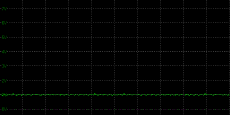
Above scale = 1
horizontal grid = 20ms
At 100% brightness a constant voltage is applied
to the backlight. As you reduce the brightness setting to dim the backlight an
oscillation is introduced operating at a frequency of 240Hz. This isn't a full
amplitude on/off switching of the backlight as you see from some PWM methods,
but there may still be some flickering introduced potentially to those who are
sensitive to it.
|
Pulse Width
Modulation Used |
Yes, low amplitude oscillation |
|
Cycling
Frequency |
240Hz |
|
Possible
Flicker at |
|
|
100% Brightness |
No |
|
50% Brightness |
Yes |
|
0% Brightness |
Yes |
For an up to date list of all flicker-free (PWM free) monitors please see our
Flicker Free Monitor Database.
Contrast
Stability and Brightness
We wanted to see how much variance there was in
the screens contrast as we adjusted the monitor setting for brightness.
In theory, brightness and contrast are two independent parameters, and good
contrast is a requirement regardless of the brightness adjustment.
Unfortunately, such is not always the case in practice. We recorded the
screens luminance and black depth at various OSD brightness settings, and
calculated the contrast ratio from there. Graphics card settings were left at
default with no ICC profile or calibration active. Tests were made using an
X-rite i1 Display Pro colorimeter. It should be noted that we used the
BasICColor calibration software here to record these, and so luminance at
default settings may vary a little from the LaCie Blue Eye Pro report.
|
OSD
Brightness |
Luminance
(cd/m2) |
Black
Point (cd/m2) |
Contrast
Ratio
( x:1) |
|
100 |
362.53 |
46.82 |
8 |
|
90 |
349.50 |
27.4 |
13 |
|
80 |
335.17 |
13.99 |
24 |
|
70 |
319.02 |
5.58 |
57 |
|
60 |
301.61 |
1.22 |
247 |
|
50 |
278.47 |
0.28 |
995 |
|
40 |
216.52 |
0.26 |
833 |
|
30 |
162.11 |
0.24 |
675 |
|
20 |
115.89 |
0.21 |
552 |
|
10 |
83.07 |
0.19 |
437 |
|
0 |
56.79 |
0.17 |
334 |
|
Total Luminance Adjustment Range
(cd/m2) |
305.74 |
Brightness OSD setting controls backlight? |
|
|
Total Black Point
Adjustment Range (cd/m2) |
46.65 |
|
Average Static Contrast Ratio |
- |
PWM Free? |
|
|
Recommended OSD setting
for 120 cd/m2 |
- |
The brightness control behaved very oddly here.
We've already established that the screen is not completely flicker free and
that a 240Hz low amplitude oscillation is introduced for anything below 100% brightness. That
would normally be a pretty good indication that PWM is being used for backlight
dimming. If you observe the power consumption as you change the brightness
setting you can see it is changing, suggesting the control is altering the
backlight intensity to a degree.
However, it seems that this PWM method is also
combined with a strange digital white level adjustment control. When you change
the brightness setting you massively impact the contrast of the image. At the
default 50% brightness setting the image looks as it should in terms of white
vs. black balance and image quality. There is a decent 995:1 contrast ratio
measured at this setting. However it is very bright, being measured at a high
278
cd/m2. If you
increase the brightness setting the image becomes very washed out and pale and
the contrast ratio drops hugely. Blacks become grey, to the point where at 100%
brightness even though you've increased the luminance to 363 cd/m2,
the image looks ridiculous. You wouldn't want to use the screen at anything
above 50% brightness for sure.
More of a problem is that if
you lower the brightness under 50% then the digital white level is again
adjusted. Down to about 40% is just about ok, although the image quality is
affected and contrast ratio crushed a little down to 833:1. Anything below that
just looks bad, with contrast ratio taking a big hit to reach anywhere near a
comfortable 120
cd/m2 type
setting. At 40% brightness the luminance is a high 217 cd/m2 which is
probably too much for normal working conditions for most people. Unfortunately
it's impossible to get a more comfortable luminance level without crushing the
contrast ratio and messing up the picture appearance. Lowering the
brightness via your graphics card settings will do the same thing as well. We
really dislike these kind of brightness adjustments!
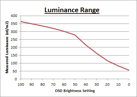
We have plotted the
luminance trend on the graph above. The luminance output is reduced as you lower
the brightness setting but the control is not only changing the backlight
intensity to a degree, but also adjusting the digital white level as we've
discussed above. Contrast ratio is ruined for pretty much any setting other than
around the default 50% level.
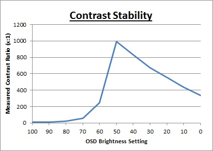
You can see here that the
contrast ratio is really crushed as you move away from the 50% brightness level.
More so if you increase the brightness, not that you'd really ever want to as
the screen is already too bright at the default 50% level.
Testing
Methodology
An
important thing to consider for most users is how a screen will perform out of
the box and with some basic manual adjustments. Since most users won't have
access to hardware colorimeter tools, it is important to understand how the
screen is going to perform in terms of colour accuracy for the average user.
We restored our graphics card to default settings
and disabled any previously active ICC profiles and gamma corrections. The
screen was tested at default factory settings using
an
X-rite i1
Pro Spectrophotometer (not to be confused with the i1 Display Pro
colorimeter) combined with
LaCie's Blue Eye Pro software suite. An X-rite i1 Display Pro colorimeter was
also used to verify the black point and contrast ratio since the i1 Pro
spectrophotometer is less
reliable at the darker end.
Targets for these tests are as follows:
-
CIE Diagram - validates the colour space
covered by the monitors backlighting in a 2D view, with the black triangle representing the
displays gamut, and other reference colour spaces shown for comparison
-
Gamma - we aim for 2.2 which is the default
for computer monitors
-
Colour temperature / white point - we aim
for 6500k which is the temperature of daylight
-
Luminance - we aim for 120
cd/m2, which is
the recommended luminance for LCD monitors in normal lighting conditions
-
Black depth - we aim
for as low as possible to maximise shadow detail and to offer us the best
contrast ratio
-
Contrast ratio - we aim
for as high as possible. Any dynamic contrast ratio controls are turned off here
if present
-
dE average / maximum -
as low as possible.
If DeltaE >3, the color displayed is significantly different from the
theoretical one, meaning that the difference will be perceptible to the
viewer.
If DeltaE <2, LaCie considers the calibration a success; there remains a
slight difference, but it is barely undetectable.
If DeltaE < 1, the color fidelity is excellent.
Default Performance and
Setup
Default settings of the screen were as follows:
|
Monitor OSD Option |
Default Settings |
|
Brightness |
50 |
|
Contrast |
50 |
|
Colour Temp |
7500k |
|
RGB |
n/a |
Wasabi Mango QHD275 Universal - Default Settings


|
|
Default Settings |
|
luminance (cd/m2) |
305 |
|
Black Point (cd/m2) |
0.31 |
|
Contrast Ratio |
998:1 |
Initially out of the box the screen was set in the
default 7500k colour temperature mode. Brightness was set at 50% by default and
we've already established in the previous section of this review that it is the
optimum setting. Anything higher or lower than this crushes contrast ratio
significantly, since the brightness control is not a true backlight adjustment,
and includes digital white level adjustments. The screen looked very bright out
of the box, but apart from that the image quality looked pretty decent.
The
CIE diagram on the left of the image confirms that the monitors colour gamut
(black triangle) is roughly equal to
the sRGB colour space. There is some minor over-coverage in all shades,
particularly blue, but not by anything significant.
Default gamma was recorded at 2.3 average, leaving it with only a 4% deviance
from the target which was good news. Especially in the absence of any decent gamma
adjustment in the OSD menu. White point was measured at 6296k
being a bit too warm from the target of 6500k but with a fairly low 3%
deviance. Oddly this was nowhere near the specified 7500k setting listed in the
OSD menu.
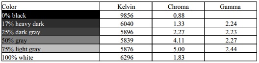
Luminance was recorded at a very bright 305
cd/m2 which is
too high for prolonged general use. As we've already discussed it's impossible
to bring this lower without impacting other areas of the setup, most notably
contrast ratio. The black depth was 0.31 cd/m2 at this default
brightness setting, giving us a decent static contrast ratio
(for an IPS-type panel) of
998:1.
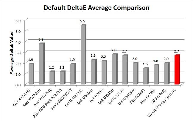
Colour accuracy was mostly pretty good out of the
box, with average dE at 2.7. Blue shades were a problem where dE ranged up to
9.5 maximum. When testing the screen with colour gradients there was some
gradation evident as you will see from most monitors in darker tones, and some
minor banding in places.
The OSD menu also offers a range of defined colour
temperature modes, along with an 'sRGB' and 'user define' mode. We tested the
sRGB mode and found that white point by default was even warmer at 5746k. The
rest of the setup remained largely unchanged, with a slight drop in contrast
ratio to 915:1. The 'user define' mode is more flexible and useful. This gives
you access to the individual RGB levels which are set at 70 each by default.
When switching to this mode you will observe a drop in luminance, down to around
162
cd/m2 by
default. This is far more comfortable to use, but is a result of the reduced RGB
levels, which in turn are basically reducing the digital white level. This does
produce a lower luminance, but also massively crushes the contrast ratio (like
lowering the main brightness control would) down to 564:1. This mode is handy
for calibration, but by default should probably be avoided due to the crushed
contrast ratio.
Calibration
We used the
X-rite i1 Pro spectrophotometer combined with the LaCie Blue Eye Pro
software package to achieve these results and reports. An X-rite i1 Display Pro
colorimeter was used to validate the black depth and contrast
ratios due to lower end limitations of the i1 Pro device.
|
Monitor OSD Option |
Calibrated Settings |
|
Brightness |
50 |
|
Contrast |
50 |
|
Colour Temp |
User Define |
|
RGB |
94, 100, 100 |
Wasabi Mango QHD275 Universal - Calibrated Settings
|
|
Calibrated Settings |
|
luminance (cd/m2) |
294 |
|
Black Point (cd/m2) |
0.29 |
|
Contrast Ratio |
1011:1 |
We changed to the 'user define' colour temperature
mode which gave us access tot he RGB channels, allowing us to adjust the white
point at the hardware level. These OSD
changes allowed us to obtain an
optimum hardware starting point and setup before software level changes would be
made at the graphics card level. We left the LaCie software to calibrate
to "max" brightness which would just retain the luminance of whatever brightness
we'd set the screen to, and would not in any way try and alter the luminance at
the graphics card level, which can reduce contrast ratio. These adjustments
before profiling the screen would help preserve tonal values and limit
banding issues. After this we let the software carry out the LUT adjustments and create an
ICC profile.
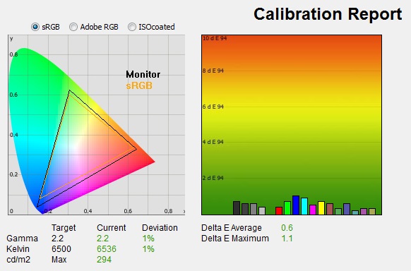
Average gamma was now corrected to 2.2 average,
correcting the 4% deviance we'd seen out of the box, but still leaving it with a
minor 1% error. The white point was now also corrected to 6536k, leaving it 1%
out from our target. Luminance was one are we could not improve without
massively effecting the contrast ratio. In the absence of a proper backlight
adjustment, you can either reduce brightness through the digital white level
change (lower the 'brightness' setting in the OSD menu), or lower brightness
from your graphics card. Either way, the image quality was negatively affected,
crushing contrast ratio and making the image look bad. We had no choice really
but to stick with the default 50% setting and live with a high luminance output
of 294
cd/m2. This
left us a black depth of 0.29 cd/m2 and maintained a very good static contrast ratio
(for an IPS-type panel) of
1011:1. Colour accuracy of the resulting
profile was excellent, with dE average of 0.6 and maximum of 1.1. LaCie would
consider colour fidelity to be very good overall.
Testing the screen with various colour gradients
showed mostly smooth transitions. There was some slight gradation in darker
tones and some minor banding introduced due to the adjustments to the graphics
card LUT from the profilation of the screen.
You can use our settings and
try our calibrated ICC profile if you wish, which are available in
our ICC profile database. Keep in mind that results will vary from one
screen to another and from one computer / graphics card to another.
Calibration Performance Comparisons
The comparisons made in this section try to give
you a better view of how each screen performs, particularly out of the box which
is what is going to matter to most consumers. When comparing the default factory
settings for each monitor it is important to take into account several
measurement areas - gamma, white point and colour accuracy. There's no point
having a low dE colour accuracy figure if the gamma curve is way off for
instance. A good factory calibration requires all 3 to be well set up. We have
deliberately not included luminance in this comparison since this is normally
far too high by default on every screen. However, that is very easily controlled
through the brightness setting (on most screens) and should not impact the other
areas being measured anyway. It is easy enough to obtain a suitable luminance
for your working conditions and individual preferences, but a reliable factory
setup in gamma, white point and colour accuracy is important and not as easy to
change accurately without a calibration tool.
From these comparisons we can also compare the
calibrated colour accuracy, black depth and contrast ratio. After a calibration
the gamma, white point and luminance should all be at their desired targets.
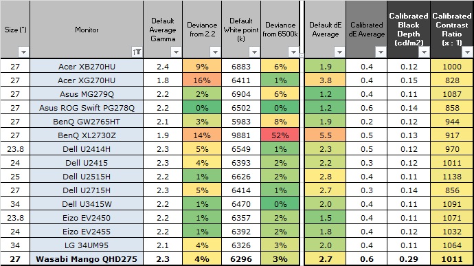
Default setup of the screen out of the box was
pretty good on the whole with gamma and white point being only a few % away from
their targets. The contrast ratio was also strong at 998:1 for an IPS panel. Brightness was the
main issue though as we've already talked about, being impossible to tame
without messing up the image quality and contrast ratio.
The display was strong when it came to black depth
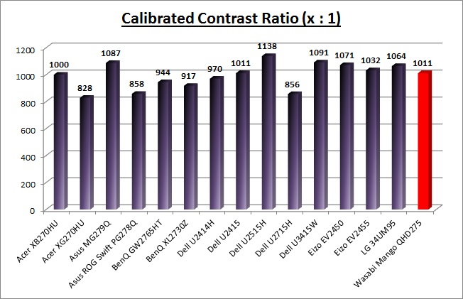
and contrast ratio for an IPS-type panel. With a calibrated contrast ratio
of 1011:1 it was comparable to some of the better screens using this kind of
panel technology. It was not quite as high as some models like the recently tested
Dell U2515H
(1138:1) which holds the record for an IPS contrast ratio. Of course
it can't compete with VA panel types which can reach over 2000:1 easily, and
commonly up to 3000:1, even close to 5000:1 in some cases (not shown here on the
graph). The issue with this screen is that this contrast ratio can only be
achieved if you stick with the default 50% brightness and live with a very
bright screen.
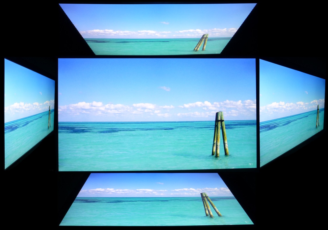
Viewing Angles

Above: Viewing
angles shown from front and side, and from above and below. Click for
larger image
Viewing angles of the screen were very good as you
would expect from an IPS-type panel. Horizontally there was very little colour tone
shift until wide angles past about 45°. A slight darkening of the image occurred
horizontally from wider angles as you can see above as the contrast shifted
slighting. Contrast shifts were more noticeable in the vertical field
with the image appearing more pale, but overall they were very good. The screen
offered the wide viewing angles of IPS technology and was free from the
restrictive fields of view of TN Film panels, especially in the vertical plane.
It was also free of the off-centre contrast shift you see from VA panels and a
lot of the quite obvious gamma and colour tone shift you see from some of the
modern VA panel type offerings. All as expected really from a modern IPS-type
panel.

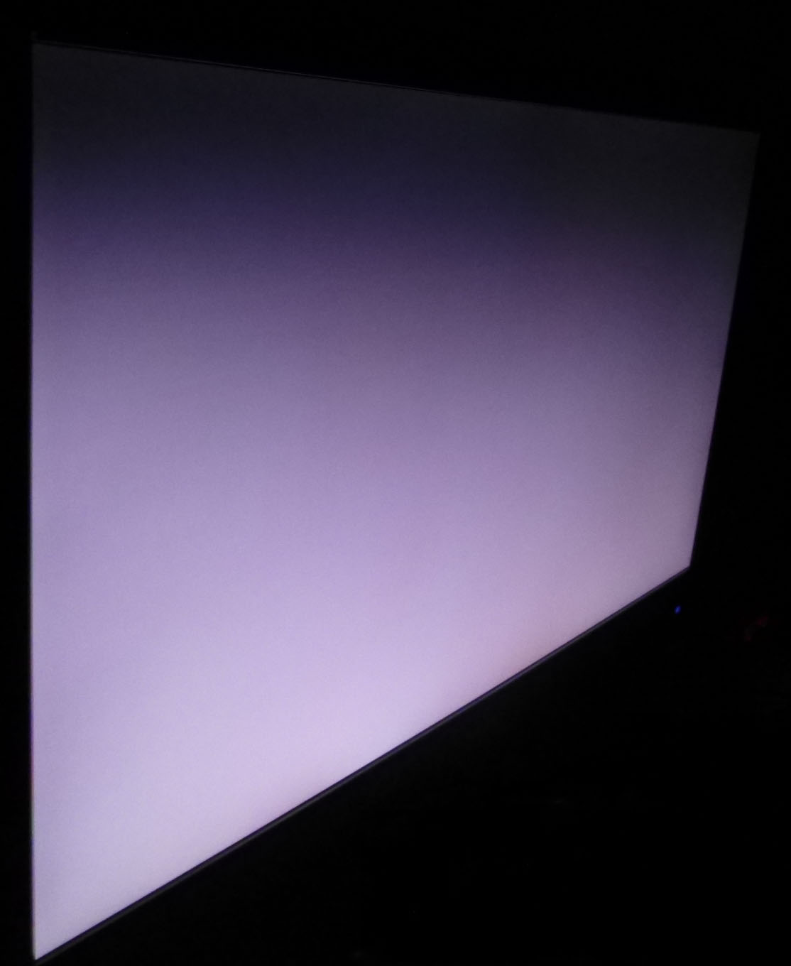
Above: View of an
all black screen from the side. Click for larger version
On a black image there is a pale purple
glow when viewed from an angle, commonly referred to as IPS-glow. This kind of
glow is common
on most IPS-type panels and can be distracting to some users. On older IPS
panels (like the one used here) the glow is more purple in colour, whereas more
modern IPS panels tend to be whiter. If you view dark content from a normal
head-on viewing position, you can actually see this glow as your eyes look
towards the edges of the screen if the screen is of a large size. This could be
distracting if you work with a lot of dark content. The glow was normal here for
an older IPS panel.
Panel Uniformity
We wanted to test
here how uniform the brightness and colour temperature was across the screen, as
well as identify any leakage from the backlight in dark lighting conditions.
Measurements of the luminance were taken at 35 points across the panel on a pure
white background. The measurements were taken using BasICColor's calibration
software package, combined with an X-rite i1 Display Pro colorimeter. The below uniformity diagram shows the difference, as a percentage,
between the measurement recorded at each point on the screen, as compared with the
central reference point.
It is worth
noting that panel uniformity can vary from one screen to another, and can depend
on manufacturing lines, screen transport and other local factors. This is only a
guide of the uniformity of the sample screen we have for review.
Uniformity of Luminance
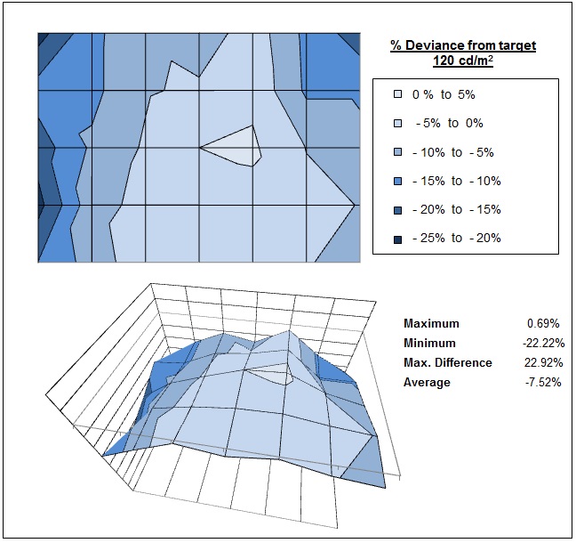
The luminance uniformity of the screen was
moderate with the sides showing some drop
in luminance by about -22% in the most extreme cases. The left hand edge was
darker than the central regions of the screen although not noticeably so in
practice - largely because you need to run at a high luminance to maintain a
decent contrast ratio on this model. Around 71% of the screen was within a
10% deviance of the central point which was not bad.
Backlight Leakage
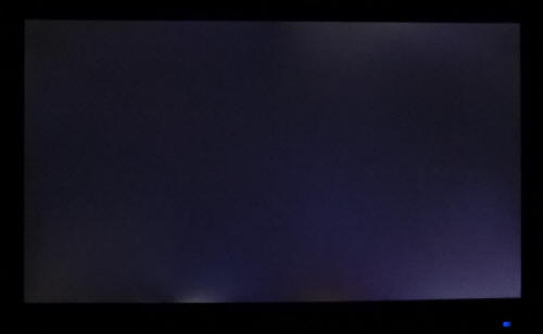
Above: All black screen in a darkened room. Click for larger version
As usual we also tested the screen with an all
black image and in a darkened room. A camera was used to capture the result. The
camera showed there was some clouding in the right hand corners where you could
see more obvious lighter patches. There was also some bleed along the bottom
edge, just left of the centre. Results may vary of course from unit to unit, but
the bleed was a bit distracting here if you view the screen in a darkened room
or view a lot of darker content.
General and Office Applications
The QHD275 feature a large 2560 x 1440 WQHD
resolution, a significant step up from the wide range of 1920 x 1080 screens on
the market.
The pixel pitch of 0.233 mm is quite small as a result, and by comparison a
standard 16:10 format 24" model has a pixel pitch of 0.270mm and a 30" model has
0.250mm. These ultra-high resolution 27" models offer a tight pixel pitch and
therefore small text as well. We found it quite a change originally coming from
21.5 - 24" sized screens back in the day, even those offering quite high
resolutions and small pixel pitches. Although now we are very used to working
with 27" 1440p screens all the time and find them very comfortable and a
significant upgrade over 1080 / 1200p models. Some users may find the small text
a little too small to read comfortably, and we'd advise caution if you are
coming from a 19" or 22" screen for instance where the pixel pitch and text are
much larger. The extra screen size takes some getting used to over a few days as
there really is a lot of room to work with but once you do, it's excellent. For
those wanting a high resolution for CAD, design, photo work etc, this is a
really good option. The image was very sharp and crisp and text was very clear.
With its
WQHD display, you enjoy 77% more desktop space than a full HD screen to spread
out your windows and palettes.
The light AG coating of the
panel is
certainly welcome, and much better than the grainy and 'dirty' appearance
of older IPS AG coatings.
The wide
viewing angles provided by this panel technology on both horizontal and
vertical planes, helps minimize on-screen colour shift when viewed from
different angles.
The default setup of the screen was pretty decent,
offering a decent gamma curve, white point, contrast ratio and low dE. The main
issue though as we've already discussed is the lack of a proper backlight
adjustment. There is a low amplitude 240Hz PWM oscillation introduced as well so the
screen cannot be classified as completely flicker free either. Since the
brightness control adjusts the digital white level it is impossible to produce a
decent, comfortable luminance for office type work without massively impacting
picture quality and contrast. You will probably need to stick with the default
50% brightness setting for a good picture, but the luminance is then close to
300 cd/m2, making it uncomfortable for office work. There was no
audible noise or buzzing from the screen, even when specifically looking for it
using test images with a large amount of text at once. The screen also remains
fairly cool even during prolonged use. There is no specific preset mode for
office work or reading so you will need to have a general mode for all your uses
really.
The screen doesn't have much in the way of extras,
with no USB ports, card readers or ambient light sensors offered. There are some
basic integrated 2x 2W stereo speakers which might be ok for the odd YouTube
clip, but not up to much else. The stand is very limited in functionality as
well with only a basic, stiff tilt adjustment offered and no height, swivel or
rotate. The VESA mounting support may be useful to some people though to give
more flexibility and the lack of ergonomic adjustments is one of the ways
they've kept the cost down on this display.
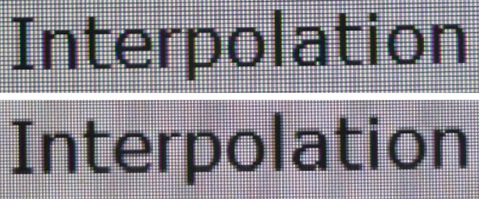
Above: photo of
text at 2560 x 1440 (top) and 1920 x 1080 (bottom)
The screen is designed to run at its native
resolution of 2560 x 1440 and at a 60Hz recommended refresh rate. However,
if you want you are able to run the screen outside of this resolution. We tested
the screen at a lower 1920 x 1080 resolution to see how the screen handles the
interpolation of the resolution, while maintaining the same aspect ratio of
16:9. At native resolution the text was very sharp and clear. When running at a 1080p resolution the text is still
reasonably clear, with low
levels of blurring. You do lose some screen real-estate as well of course but
the image seems to be quite well interpolated from 1080p sources if needed.
Responsiveness and Gaming
|
Quoted G2G Response Time |
6ms G2G |
|
Quoted ISO Response Time |
n/a |
|
Panel Manufacturer and
Technology |
LG.Display |
|
Panel Part |
LM270WQ1-SLB1 |
|
Overdrive Used |
Yes |
|
Overdrive Control Available to
User |
No |
|
Overdrive Settings |
n/a |
The QHD275 is rated by Wasabi Mango as having a 6ms G2G response time, which indicates the panel uses
overdrive /
response time compensation (RTC) technology to boost pixel transitions
across grey to grey changes. There is no user control over the overdrive impulse
within the OSD menu so we are reliant on the manufacturer setup. The
part
being used is the
LG.Display LM270WQ1-SLB1 IPS panel. Have a read about response time in
our
specs section if you need additional information about response times and
their measurement.
We will first test the screen using our thorough
response time testing method. This uses an oscilloscope and photosensor to
measure the pixel response times across a series of different transitions, in
the full range from 0 (black) to 255 (white). This will give us a realistic view
of how the monitor performs in real life, as opposed to being reliant only on a
manufacturers spec. We can work out the response times for changing between many
different shades, calculate the maximum, minimum and average grey
to grey (G2G) response times, and provide an evaluation of any overshoot present
on the monitor.
We use an
ETC M526
oscilloscope for these measurements along with a custom photosensor device.
Have a read of
our response time measurement article for a full explanation of the testing
methodology and reported data.
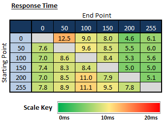
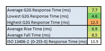
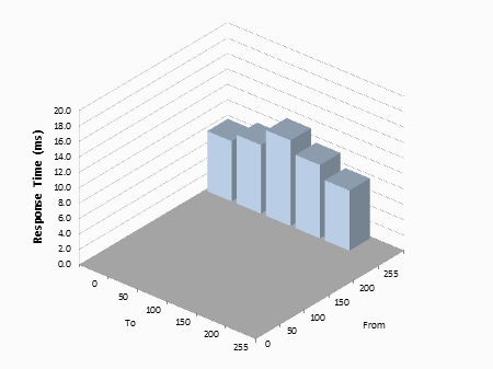
The average G2G response time was
measured at 7.7ms which was very good for a 60Hz IPS-type panel overall. Some
measurements reached as low as 4.6ms, meaning the screen does live up to its
specified 6ms G2G figure in practice. Rise times were slightly faster than fall
times and overall we were quite pleased as in the past we've seen fairly slow
response times from a lot of Korean monitors.

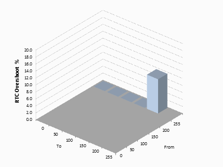
Unfortunately the pretty low response times were
not without some issue. Some fairly large amounts of overshoot were evident on
the rise times, resulting in some pale trailing and artefacts on moving objects.
It was not too catastrophic but the overshoot was certainly at a high level. A
good 60Hz IPS-type panel can reach down to around 8.6ms G2G minimum most of the
time without introducing any major overshoot, and so it seems the RTC had been
pushed a little too far here. Response times had reached down to 7.7ms G2G, but
some fairly high overshoot was introduced as a side-effect. You are not able to
control the overdrive impulse either on this display so you have to live with
their default setup.
Display Comparisons
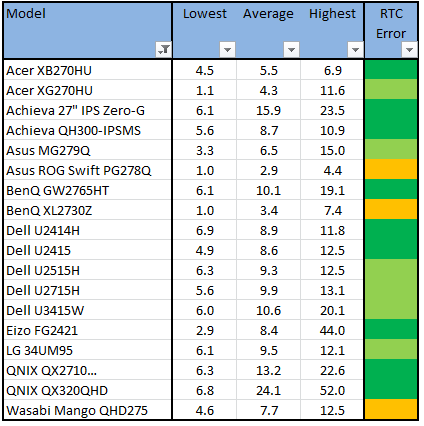
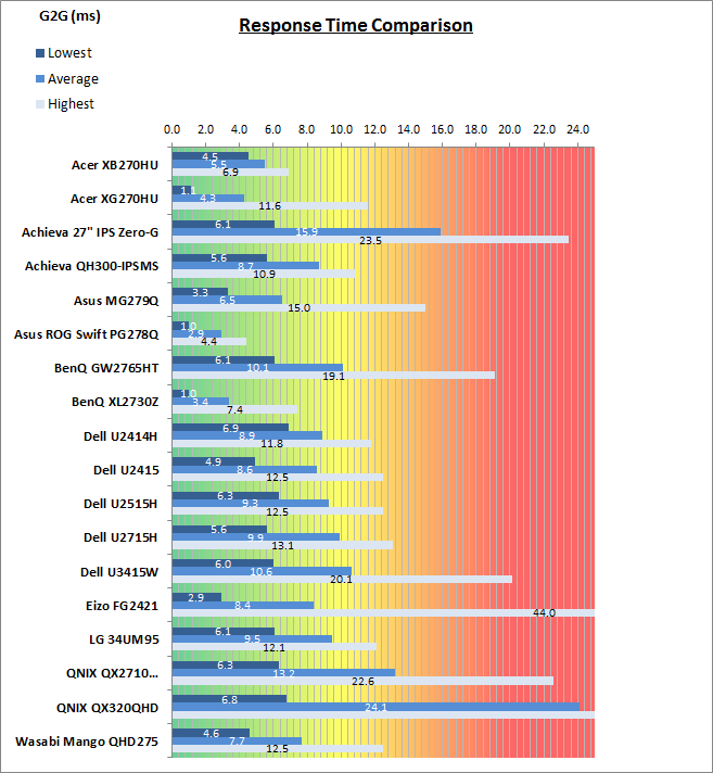
The above comparison table and graph shows you the
lowest, average and highest G2G response time measurement for each screen we
have tested with our oscilloscope system. There is also a colour coded mark next
to each screen in the table to indicate the RTC overshoot error, as the response
time figure alone doesn't tell the whole story.
The measured response times of the QHD275 were
good here, with a 7.7ms G2G average being faster than all the other 60Hz
IPS-type panels shown. However, as we've already discussed it comes at the cost
of some moderate levels of overshoot and the introduction of some pale halos in
moving images. The new 144Hz capable IPS-type panels in the
Asus MG279Q and
Acer
XB270HU are faster, reaching down to 5.5 - 6.5ms with little to no overshoot. Modern TN Film panels are faster than the QHD275 as well as you might
expect, reaching down to 2.9 - 3.4ms G2G average on models like the
Asus ROG
Swift PG278Q and
BenQ XL2730Z respectively, but again with moderate levels of
overshoot introduced.
The screen was also tested using the chase test in
PixPerAn for the following display comparisons. As a reminder, a series of
pictures are taken on the highest shutter speed and compared, with the best case
example shown on the left, and worst case example on the right. This should only
be used as a rough guide to comparative responsiveness but is handy for a
comparison between different screens and technologies as well as a means to
compare those screens we tested before the introduction of our oscilloscope
method.

27"
6ms
G2G LG.Display IPS
In practice the QHD275 showed low levels of
blurring in these tests, with the moving object looking quite sharp and clear.
The colour transitions in this test didn't show any dark or pale overshoot,
although we know from our oscilloscope tests that there is some there on certain
transitions. Sadly with no control over the RTC impulse the overshoot
could not be eliminated, although overall it was only at a moderate level.
27"
6ms
G2G LG.Display IPS
27"
4ms
G2G AU Optronics AHVA
27" 6.5ms G2G
LG.Display H-IPS
27"
8ms
G2G LG.Display AH-IPS (Response Time = Normal)
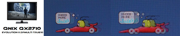
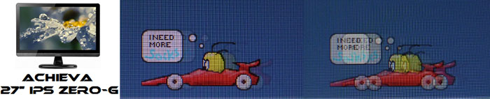
It is also interesting to compare the QHD275 to some of the other Korean models
we have tested, along with the popular
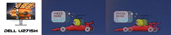
Dell U2715H. You can see that the
QNIX and
Achieva models show a far more noticeable trail behind the moving car, with
high levels of blurring being evident. Their response times were measured at
13.2ms and 15.9ms G2G respectively, so are quite a lot slower than the Wasabi
Mango display. Those other Korean screens didn't seem to use any overdrive at
all, delivering slow response times from their IPS-type panels but without any
overshoot at all. The gaming performance is certainly better on the Wasabi Mango
with much faster pixel response times, even if you do need to live with some
moderate overshoot sometimes. The popular Dell U2715H was a little slower than
than Wasabi Mango (9.9ms G2G) but not by a massive amount, also showing lower
levels of overshoot.
27"
6ms
G2G LG.Display IPS

27"
4ms G2G AU Optronics AHVA (IPS-type)
@ 144Hz (OD = Normal)
27"
1ms
G2G AU Optronics TN Film @ 144Hz (OD = Normal)
27"
1ms
G2G AU Optronics TN Film @ 144Hz (AMA = High)
23.5" 4ms G2G
Sharp MVA + 120Hz
We've also included a comparison above against
some other very fast 120Hz+ compatible screens we have tested. The screens shown
here are all aimed primarily at gamers and have various features and extras
which make them more suitable overall for gaming.
Firstly there is a comparison against the excellent
Acer XB270HU with very fast response times (5.5ms G2G, no overshoot), 144Hz
refresh rate and also NVIDIA G-sync and Ultra Low Motion Blur (ULMB) support.
That certainly delivers a much better gaming experience than the Wasabi Mango,
probably to be expected given that's a gaming screen and a much higher retail
price. It's currently our bench-mark for IPS panel gaming - well, actually our
current favourite gaming screen of any type!
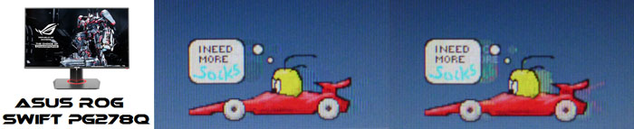
Then there's the very popular
Asus ROG Swift PG278Q with its 144Hz refresh rate and fast response time TN
Film panel. This showed very fast pixel response times (2.9ms G2G), with
moderate levels of overshoot, but smooth movement thanks to its increased
refresh rate. You are able to reduce the motion blur even more through the use
of the ULMB strobed backlight as well if you need to and again this model also
supports NVIDIA's G-sync technology.
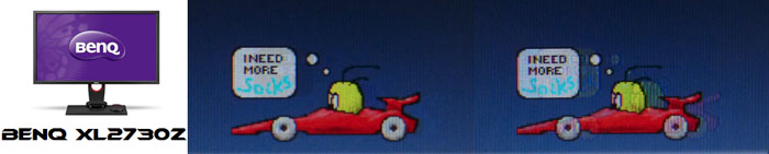
Then there is a comparison against the
BenQ XL2730Z
with another very fast TN Film panel and 144Hz refresh rate. This showed very
low levels of motion blur (3.4ms G2G), but some dark overshoot was introduced as a
side-effect as you can see. This screen also includes a native Blur Reduction
mode to help eliminate further perceived motion blur and works well, along with
AMD FreeSync support.
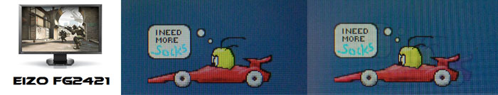
Lastly there is the MVA based Eizo FG2421 screen
with a fast response time (especially for the panel technology being used) and
120Hz refresh rate support. There is also an additional 'Turbo 240' motion blur
reduction mode which really helps reduce the perceived motion blur in practice.
Additional Gaming Features
-
Aspect Ratio Control -
The QHD275 has only two options in the menu for
aspect ratio control. There are options for full
and 4:3 only. There is no "aspect" option to maintain the source aspect at
whatever it is, and no 1:1 pixel mapping option either. This isn't a major
problem on this screen as if you're using a PC and want to run at a non-native
resolution (for gaming etc) you can let the graphics card handle the scaling
instead. Since the screen is a native 16:9 aspect ratio as well, if you are
using an external device (games console, Blu-ray player) it should be ok since
those generally run at 16:9 aspect themselves. You won't be able to 1:1 pixel
map the common 1080p input, but it will at least not skew the aspect ratio.
External inputs not from a PC of 16:10, 5:4 aspect ratios will be an issue though.
-
Preset Modes -
There are no specific gaming preset modes
available on this screen.
Lag
We have written an in depth article about
input lag and the various measurement techniques which are used to evaluate
this aspect of a display. It's important to first of all understand the
different methods available and also what this lag means to you as an end-user.
Input Lag vs. Display Lag vs. Signal
Processing
To avoid confusion with different terminology we
will refer to this section of our reviews as just "lag" from now on, as there
are a few different aspects to consider, and different interpretations of the
term "input lag". We will consider the following points here as much as
possible. The overall "display lag" is the first, that being the delay between
the image being shown on the TFT display and that being shown on a CRT. This is
what many people will know as input lag and originally was the measure made to
explain why the image is a little behind when using a CRT. The older stopwatch
based methods were the common way to measure this in the past, but through
advanced studies have been shown to be quite inaccurate. As a result, more
advanced tools like SMTT provide a method to measure that delay between a TFT
and CRT while removing the inaccuracies of older stopwatch methods.
In reality that lag / delay is caused by a
combination of two things - the signal processing delay caused by the TFT
electronics / scaler, and the response time of the pixels themselves. Most
"input lag" measurements over the years have always been based on the overall
display lag (signal processing + response time) and indeed the SMTT tool is
based on this visual difference between a CRT and TFT and so measures the
overall display lag. In practice the signal processing is the element which
gives the feel of lag to the user, and the response time of course can
impact blurring, and overall image quality in moving scenes. As people become
more aware of lag as a possible issue, we are of course keen to try and
understand the split between the two as much as possible to give a complete
picture.
The signal processing element within that is quite
hard to identify without extremely high end equipment and very complicated
methods. In fact the studies by Thomas Thiemann which really kicked this whole
thing off were based on equipment worth >100,1000 Euro, requiring extremely high
bandwidths and very complicated methods to trigger the correct behaviour and
accurately measure the signal processing on its own. Other techniques which are
being used since are not conducted by Thomas (he is a freelance writer) or based
on this equipment or technique, and may also be subject to other errors or
inaccuracies based on our conversations with him since. It's very hard as a
result to produce a technique which will measure just the signal processing on
its own unfortunately. Many measurement techniques are also not explained and so
it is important to try and get a picture from various sources if possible to
make an informed judgement about a display overall.
For our tests we will continue to use the SMTT
tool to measure the overall "display lag". From there we can use our
oscilloscope system to measure the response time across a wide range of grey to
grey (G2G) transitions as recorded in our
response time
tests. Since SMTT will not include the full response time within its
measurements, after speaking with Thomas further about the situation we will
subtract half of the average G2G response time from the total display lag. This should allow us to give a good estimation of
how much of the overall lag is attributable to the signal processing element on
its own.
Lag Classification
To help in this section we will also introduce a broader classification system
for these results to help categorise each screen as one of the following levels:
-
Class 1)
Less than 16ms / 1 frame lag at 60Hz - should be fine for gamers, even at high levels
-
Class
2)
A lag of 16 -
32ms / One to two frames of lag at 60Hz - moderate lag but should be fine for many gamers.
Caution advised for serious gaming and FPS
-
Class
3)
A lag of more
than 32ms / more than 2 frames of lag at 60Hz - Some noticeable lag in daily usage, not
suitable for high end gaming
For the full reviews of the models compared here and the dates they were written
(and when screens were approximately released to the market), please see our
full
reviews index.
|
(Measurements in ms) |
Standard Mode |
|
Total Display Lag (SMTT
2) |
28.80 |
|
Pixel Response Time
Element |
3.85 |
|
Estimated Signal
Processing Lag |
24.95 |
|
Lag Classification |
2 |
|

Class 2 |
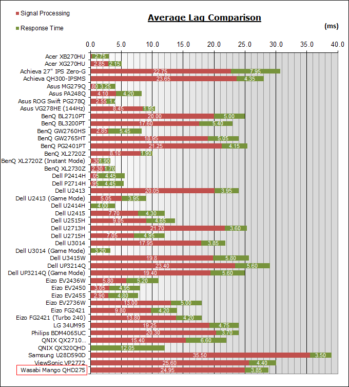
We have provided a comparison above against other
models we have tested to give an indication between screens. The screens
tested are split into two measurements which are
based on our overall display lag tests (using SMTT) and half the average G2G
response time, as measured by the oscilloscope. The response time is split from
the overall display lag and shown on the graph as the green bar. From there, the
signal processing (red bar) can be provided as a good estimation.
The QHD275 showed a total display lag of 28.8ms.
3.85ms of this can be accounted for by pixel response times roughly, leaving us
with approximately 24.95ms of signal processing lag. This is basically 1.5
frames at 60Hz refresh rate and fairly standard for displays with a scaler and
multi-inputs like this. It could be a bit too high for people wanting to play
FPS or competitive gaming.
Movies and Video
The following summarises the screens performance
in video applications:
-
27"
screen size makes it a reasonable option for an all-in-one multimedia screen,
much smaller than LCD TV's and many larger format desktop monitors which are
now emerging.
-
16:9
aspect ratio is well suited to videos and movies, leaving
you with smaller/no borders on DVD's and wide screen content at the top and
bottom than on a 16:10 aspect display.
-
2560 x
1440 resolution can support full 1080 HD resolution content.
-
Digital interfaces support HDCP for any encrypted and protected content
-
Good range of interface options available
here.
-
Cable provided in the box
for Dual-link DVI
only, no HDMI or DisplayPort cables provided.
-
Light
AG coating provides clear images with no major graininess, and without the
unwanted reflections of a glossy solution.
-
Contrast ratio is the problem as it varies
massively across the brightness adjustment range. The brightness control
changes the digital white level as well as (to a degree) the backlight
intensity, and so you massively crush contrast ratio when you alter away from
a high setting of around 50%. As a result, running the screen at a more
comfortable lower luminance results in a significantly reduced contrast ratio
and a loss of a huge amount of detail in the darker tonal range. This is not a
good option for movie viewing as a result.
-
Black
depth and contrast ratio are very good for an IPS-type panel at 1011:1
after calibration. Detail in darker scenes should not be lost as a result as
long as you can live with the default 50% brightness setting and resulting
high luminance.
-
No
specific preset modes offered for movies or any other uses.
-
Very
good pixel responsiveness which can handle fast moving scenes in movies
without issue. Some moderate overshoot issues on some transitions which could
result in some pale trailing. No option to turn the overdrive down/off sadly.
-
Wide viewing angles from IPS panel technology
meaning several people could view the screen at once comfortable and from a
whole host of different angles. Pale purple glow from an angle on black content may
be problematic to some users and is common for IPS panel technology.
-
Some
backlight leakage on our sample but results may vary.
-
Very limited range of ergonomic adjustments
available from the stand, with only tilt available. Lacking any other
adjustments making it potentially a problem for moving your viewing position.
-
Basic 2x 2W integrated stereo speakers offered on this model along with a
headphone connection. Might be ok for the odd video clip but not a full movie.
-
Hardware aspect ratio control provided with options for full and 4:3 only.
Missing an "auto aspect" and 1:1 pixel mapping which may be problematic for
some external devices depending on their source aspect ratio.
-
Picture By Picture (PbP) or Picture In Picture (PiP) are available on this
model if you want to use them.
Conclusion
We have mixed feelings about the Wasabi Mango
QHD275 Universal. On the positive side the screen delivers a decent IPS panel
with 2560 x 1440 at a very low retail price. That's one of the key aims here for
Korean manufacturers like Wasabi Mango, allowing this screen to be priced at
~£220 GBP, whereas mainstream competitors like the Dell U2715H are ~£390 GBP.
The panel delivers a high resolution, pretty decent default setup and the wide
viewing angles offered from this technology. We were pleased with the wide range
of inputs offered, considering those are normally one of the first things to go
when cutting cost. Pixel response times impressed us as well, whereas we've seen
very slow Korean panels in the past this one was overdriven nicely. Maybe a
little too far given the moderate overshoot but still a better result than other
manufacturers we've seen in the past.
Unfortunately we cannot overlook the very
disappointing brightness control, adjusting the digital white levels and causing
real problems for anything other than the default luminance. That's unforgivable
for any display we feel, although frustratingly common on Korean displays it
seems. Obviously the low retail cost can also be seen in some areas, with a very
basic stand being one area where costs have been clearly trimmed. Build quality
and design are also a bit budget but to be expected we suppose.
If you appreciate the review
and enjoy reading and like our work, we would welcome a
donation
to the site to help us continue to make quality and detailed reviews for you.
|
Pros |
Cons |
|
Low cost IPS display with 2560
x 1440 resolution |
Brightness control does not
control backlight properly, creating a lot of problems |
|
Decent response times |
Limited ergonomic adjustments
from the stand due to cost cutting |
|
Good range of connectivity
options |
Fairly high lag |