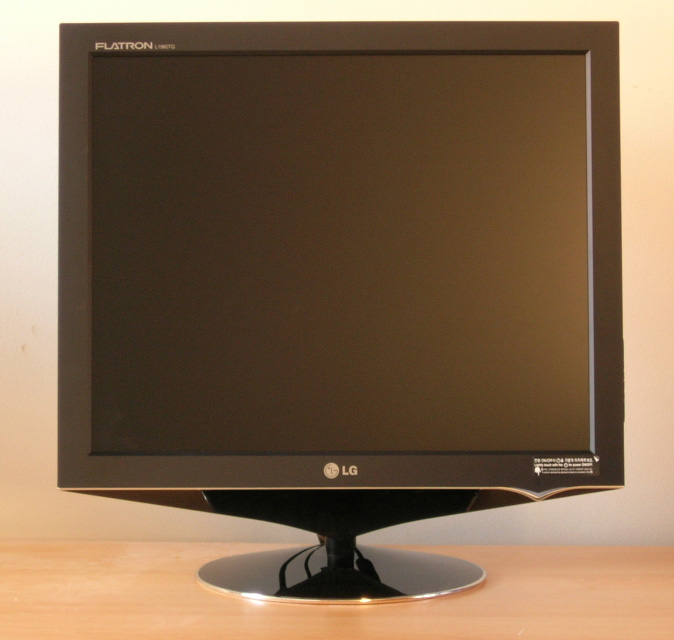
The LG L1960TQ is a member of LG's new "Premium"
line of displays, accompanying the Fantasy Series which features an impressive
range of designs and specifications. Like the Fantasy Series screens, the
L1960TQ uses a 4ms G2G rated TN Film panel, along with
Digital Fine Contrast (DFC) technology to offer a dynamic contrast ratio of
2000:1. While the Fantasy Series models offer a more unusual design, there is no
denying that the L1960TQ remains impressive in its appearance, as well as on
paper:
|
Size |
19" |
Colour Depth |
16.2
million colours |
|
Resolution |
1280
x 1024 |
Viewing Angles |
160
/ 160 |
|
Response Time |
4ms
G2G |
Panel Technology |
TN Film |
|
Contrast Ratio |
2000:1 (DFC) |
Interfaces |
VGA,
DVI |
|
Brightness |
300
cd/m2 |
Colour |
Black with silver trim |
|
Special Features |
Tilt
functionality, dynamic 'Digital Fine Contrast' (DFC) |
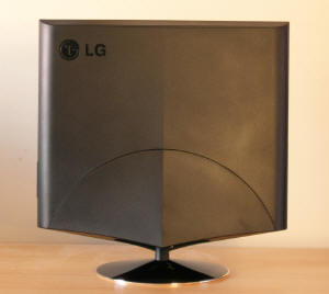
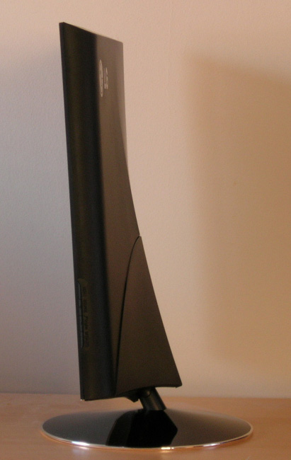
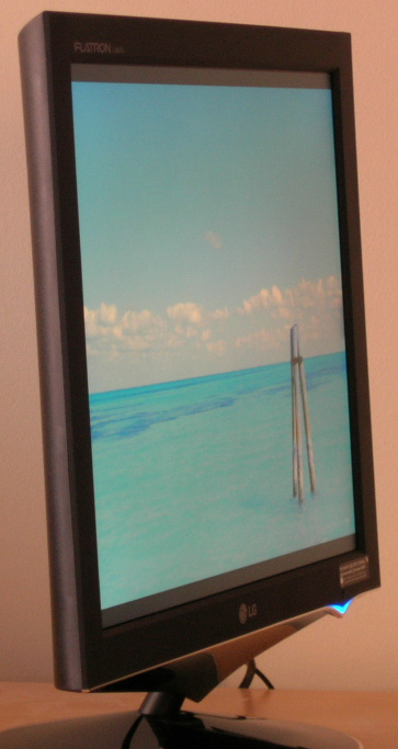
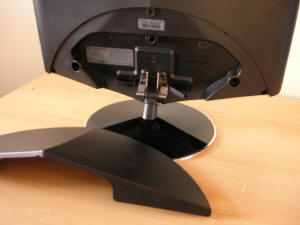
Above: Rear and
side views of the screen. Click for large images
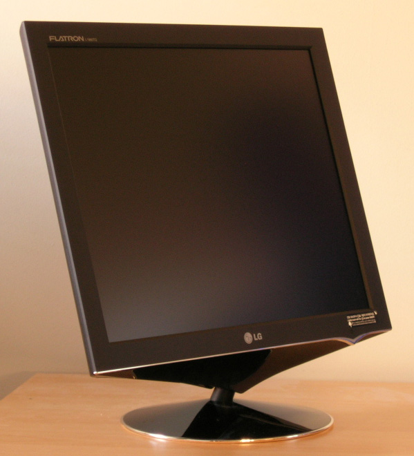
The screen is in an attractive black finish with a
reflective shiny base and silver trim along the bottom of the bezel and around
the edge of the stand. While the screen is well designed, it is sadly a little
lacking in functionality, only offering a minimal, and quite stiff, tilt range.
This is a little limited compared with some models available on the market,
including for example the
LG L1932P, but features such as rotation and pivot are not important to all
users.
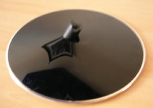
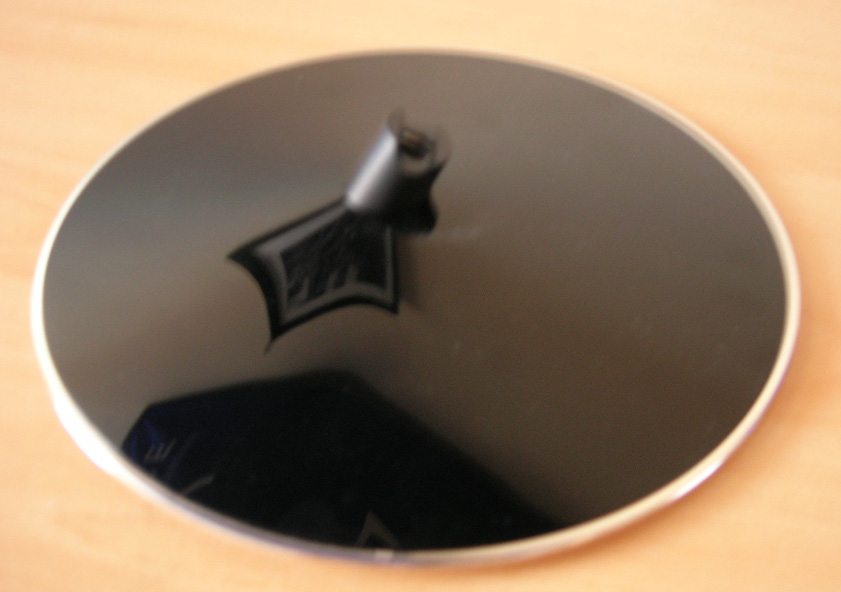
Above left:
Detachable base
Above right: removable backing exposing interface options
The stand comes packaged seperately but is easily
slid into position before being locked in place by a simple turn screw. There is
no need for screwdrivers and so dismantling and transporting the screen is easy
enough. The lower casing at the back is easily detached to reveal the DVI, VGA
and power connections, with a cable tie being present to help keep cables tidy.
Due to the nature of the stand though, it is still possible to see the cables
trail from the back of the screen as there is not enough stand to hide them
completely. Materials are study and the screen feels well constructed.
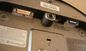

Above left: DVI,
power and VGA connections shown, usually hidden by removal plastic backing to
the display
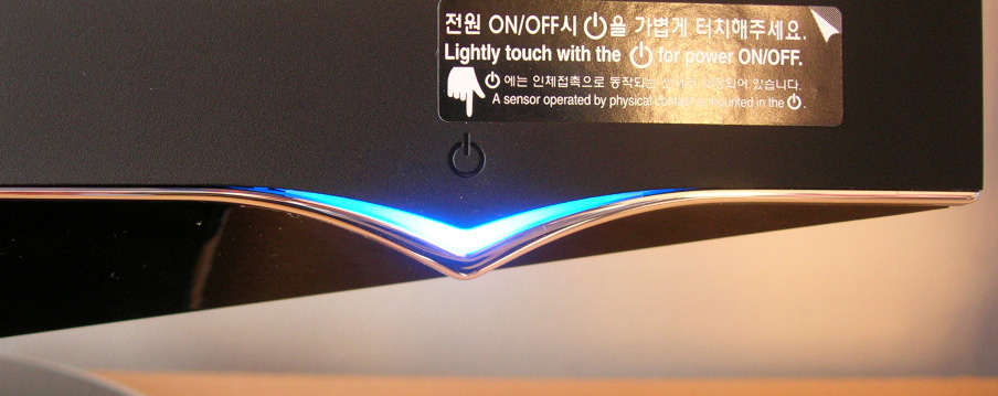
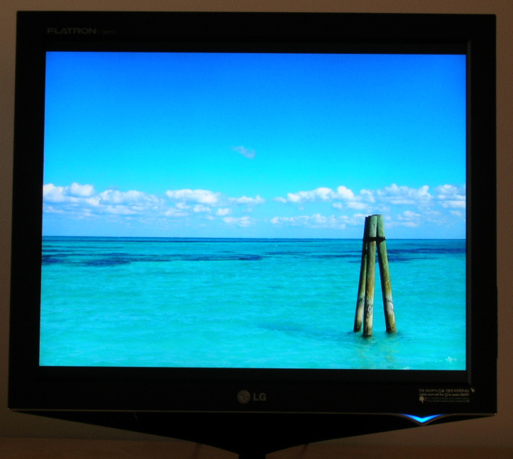
Above right: Illuminated blue power LED
The screen comes (unusually) with an external
power brick and so the power interface on the back of the screen itself is small
and unobtrusive. The power button is a touch sensitive button which works pretty
well, which once pressed, illuminates a nice looking blue LED power light as
shown above. In standby mode, this glows orange. The OSD operating buttons are
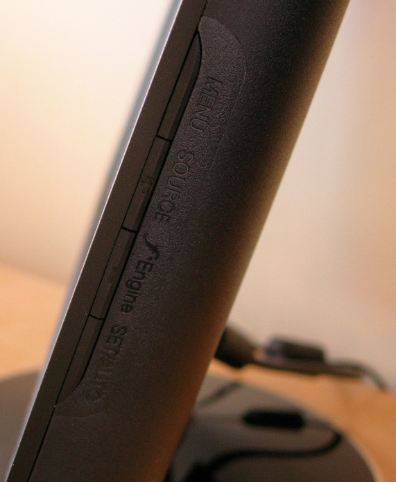
located on the right hand side of the screen and are stream-lined into the
design of the bezel. While these are well hidden and do not affect the monitors
appearance, they are sometimes a little tricky to use. There is a single button
to activate LG's F-Engine feature at least, making selection of preset profiles
easy enough to use.
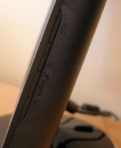

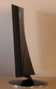
Above left: Side
view showing OSD operation buttons

Colour Quality and
Accuracy
The L1960TQ utilises a 6-bit TN Film panel, with
FRC technology being used to produce a 16.2 million colour palette. An important
thing to consider for most users is how a screen will perform out of the box and
with some basic manual adjustments. Since most users won't have access to
hardware colorimeter tools, it is important to understand how the screen is
going to perform in terms of colour accuracy for the average user. I restored my graphics card to default settings
and set it to its standard profile. The LG L1960TQ was tested at default factory
settings out of the box using the
LaCie Blue Eye Pro and their accompanying software suite.
Default settings of the screen were 100 brightness, 70 contrast ratio, and 50
for each of the RGB values. The default colour temperature of the screen was set
at 6500k, which is the desirable colour temperature we are hoping to reach with
the screen. I left the screen at these settings to test colour accuracy out of
the box. I also left the screen in the "user" mode of the F-Engine feature:
LG L1960TQ - Default Settings
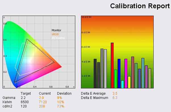
Out of the box the screen looked too bright and
colours felt a little washed out as a result. This was expected, since the
screen brightness setting was at 100% already and too high for comfortable use. The LaCie Blue Eye Pro showed the
same result, with a luminance recorded as 208 cd/m2, a 73% difference
between that and the desired lumincance value of 120 cd/m2 for
regular lighting conditions and comfortable viewing. The preset colour
temperature of 6500k was also a little off, being recorded by the colorimeter as
7129k.
The graph on the right shows the DeltaE values for
colours tested by the LaCie Blue Eye Pro. As a reminder, the lower these bars
down the Y-axis, the better, in terms of colour accuracy. For reference, LaCie
describe the DeltaE readings as:
-
If DeltaE >3, the color displayed is significantly different from the
theoretical one, meaning that the difference will be perceptible to the
viewer.
-
If DeltaE <2, LaCie considers the calibration a success; there remains a
slight difference, but it is barely undetectable.
-
If DeltaE < 1, the color fidelity is excellent.
The results show that colour
accuracy was generally pretty poor out of the box, with an average value of 3.5
recorded. This was not as bad as I have seen from some other screens at default
factory settings, but is not suitable for any colour critical work at this
stage. This is probably rather irrelevant however since if you were needing a
screen with a high colour accuracy you would probably not choose TN Film based
panels, and you would also invest in a hardware colorimeter to ensure you got
the most out of the screen.
The 4 CCFL backlight tubes used in the L1960TQ are standard TFT monitor
backlighting, and feature colour gamut covering 72% of the NTSC colour
space. The monitor did pretty much cover the sRGB gamut range in testing, with only blue
range being a little lacking. This was actually evident in practice as well, as
the screen did look a little 'warm' and with a tendency towards red being
noticeable at default settings. Black depth was measured at 0.7 cd/m2 (not shown here but available
in the PDF report), giving a usable contrast ratio of 297:1. This is a pretty
weak black depth but can be attributed to the excessive brightness setting of
the screen at factory defaults.
LG L1960TQ - Calibrated Results
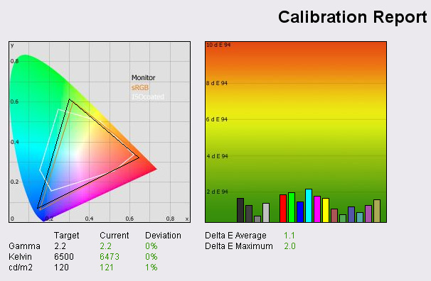
During calibration the screen was changed to
35 brightness and 67 contrast
using the OSD. After calibration the luminance, gamma and colour temperature
were far more accurate and the monitor covered the sRGB gamut range more evenly.
DeltaE was on average reduced to 1.1 offering pretty excellent colour accuracy
as measured by LaCie. The maximum DeltaE was only 2.0 and so any slight
difference between the desired colour, and produced colour was barely
detectable. This was a good improvement over default settings and again goes to
show that with the right calibration tools, it is possible to get some decent
colour accuracy out of TN Film panels. The DeltaE values were not as low as
those measured on some other TN Film based screens I have tested (LG
L1932P and
Samsung SM205BW for example) but performance was perfectly acceptable.
Black depth was
also measured at a
far more acceptable 0.3 cd/m2 giving a usable contrast ratio of 403:1. In
practice I found the L1960TQ did offer bright and rich colours, with the only
slightly annoying issue being related to the viewing angles of the screen. As is
common with most TN Film panels, vertical viewing angles were restrictive.
However, the L1960TQ showed some variation in colour temperature as you moved
above and below your view directly facing the screen. This is not something I've
noticed as clearly on other TN based panels I've tested and the issue proved a
little distracting, particularly in office use. Lifting your head up
slightly above the central view showed a slight tendency towards blue, while
dropping your head down a little showed a tendency towards red. This was not
really an issue for most uses, but when viewing some images, it would effect the
skin tones quite noticeably.
There was only slight gradation across RGB colour
gradients, and it was nothing particularly problematic. I saw no issues in
regular use, and it seems the 6-bit +FRC panel is performing well in this
regard. There was no noticeable FRC artefacts either and no obvious twinkling
across colour bands.
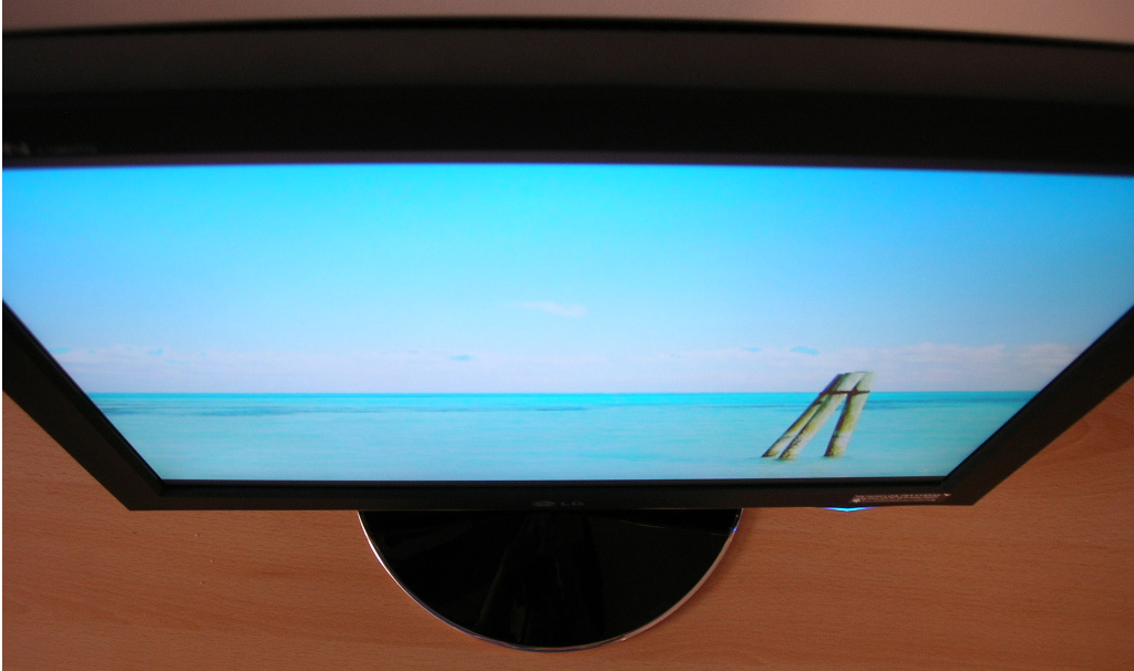
Viewing Angles
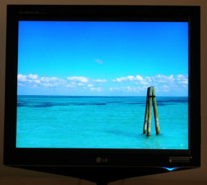
Above: Front
view and side views
Below: Top view and bottom view
As demonstrated in the above images, the viewing
angles of the L1960TQ were as expected. From a side view the screen showed that
horizontal viewing angles were adequate at least but there was some noticeable
contrast shift, even with a small change in the viewing angle. Vertically the screen
showed the trade-mark contrast shifts of TN Film panel technology. As mentioned
before, slight movements in viewing field vertically also showed some noticeable
difference in colour temperature with a tendancy towards red as you lower your
head, and a tendancy towards blue as you lift your head above the central view.
However, the tilt function of the screen does allow you to position the screen
at a comfortable height and this issue can be largely avoided in practice. It
was a little off-putting when compared with S-IPS or VA based screens which
offer much wider viewing angles.
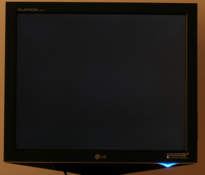
Panel Uniformity
Panel uniformity
on a black screen. Click for larger image
Panel uniformity was actually
very good on this screen, with no obvious backlight leaking from the edges or
corners. This resulted in no adverse issues during movie viewing which is often
a problematic area when it comes to panel uniformity.
Office and Windows
Testing the screen with both
VGA and DVI connections exhibited an ever so slight difference in image
sharpness; with the DVI interface being slightly clearer. However, the VGA
connection is of a very good standard as well. With a native resolution of 1280
x 1024, office use was comfortable and text was nice and clear. Personally I
prefer a larger screen so that side by side office working is possible, and the
19" screen size here does not offer that desktop real estate. While the pixel
pitch is quite large due to the resolution and screen size, it is perfectly
acceptable and still offers sharp and crisp text.
There is an F-Engine preset
for "text" on the L1960TQ but I found it increased brightness compared with my
calibrated (120 cd/m2) "user" setting, and so was not really desirable to use. It is there
from a simple button access for those who do want to use it, and at least it
shows you a split screen of before and after so you can evaluate whether you
want to use it or not. When viewing photos, the F-Engine "User" > "Skin Tone
Enhancement" preset mode was handy to enhance skin tones quickly and with a few
presses of the buttons.
Responsiveness and Gaming
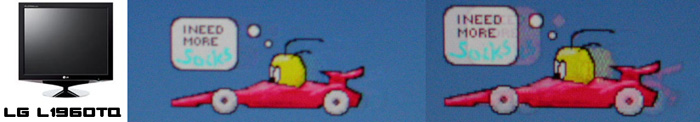
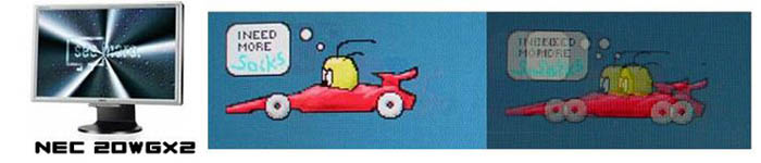
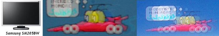
I tested the screen using PixPerAn software which
showed some quite impressive results in the 'flag test' moving car animation.
The moving image showed no obvious ghost images behind the car but blurring of
the textures was evident. The screen uses a 4ms G2G rated TN Film panel, and
thanks to a heavy dose of RTC, they have done a good job of producing a
responsive screen in practical use as well as on paper. I did feel that it was a
little behind the performance of the
NEC LCD20WGX2 I have examined before in these tests, with the moving image
being a little more blurred than on the NEC's AS-IPS panel. Still, a decent
result and a step ahead of non-overdriven panels like that in the
Samsung SM205BW for example.
I tested the screen in some games as well. There
was no real issue with ghosting although you could notice the usual blur across
textures which is inherant to LCD displays if you look closely. Even the fastest
TN Film matrices will leave you with some texture blur, but this is largely down
to image persistance in the eye, and it is other technologies that are looking
promising when it comes to eliminating perceived motion blur (BFI, MPA, 100Hz
etc). The L1960TQ performed well enough in games though. I switched the display
over to the F-Engine "User" preset mode and opted for a brightness of 70, and
the ACM (Adaptive Colour Management) setting for "enhanced colour". This helped
improve brightness and colour vibrancy in the games which I think can be handy
and makes the games more pleasing to the eye. Testing the screen with the LaCie
Blue Eye Pro showed that colour accuracy was way off, but that can be expected
given the aim here is overly bright and 'cartoony' colours.
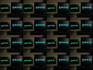
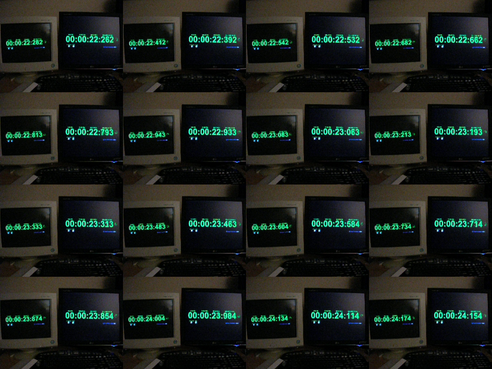
Above: Input
lag. Click for larger image
The screen was hooked up in clone mode with a CRT
in order to test input lag and it's degree. As you can see from the above image,
the L1960TQ was commonly 10 - 20ms behind the CRT. This is a little higher than
other screens I have tested, which are also gamer orientated (LG L1932P - 10ms,
Samsung SM205BW - 10ms). However, I doubt many people would really notice this
in practice. If you're really a hard core FPS gamer and think this might be
problematic to you, maybe there are some other screens which don't show as much
input lag as the L1960TQ. On the other hand, if you're that bothered by it,
maybe a CRT would be more suitable!
Movies and Video
The L1960TQ performed pretty well in movie tests
using Microsoft's HD content. There was minimal twinkling and colours looked
vivid and black depth was impressive. I was actually quite please with it's
performance in this regard, and certainly from a metre or two away there was no
real problem with watching movies on the screen. Watching movie clips with a lot
of dark scenes showed some problems however as it was often very hard to make
out detail and the screen seemed overly dark. Using the monitor's F-Engine
preset for "movies" enhanced the black depth, but meant that dark scenes were
hard to watch. The black depth of the screen is not as good as on some other
panels, particularly VA based technologies and so this is one area which could
be better on the L1960TQ. Obviously the 5:4 aspect ratio and TN Film technology
don't lend themselves to movie watching. If you are planning to use your screen
to view a lot of movies, I'd suggest that a widescreen format model would be
better. You may also want to consider something a little bigger than a 19"
model, especially with the availability of well priced 20" and 22" models
nowadays. MVA based screens may well be the best option for movie watching with
their improved viewing angles and deeper black depth, but if you want to stick
with a lower priced screen, a 22" TN Film model might be more suitable than a
19" 5:4 aspect model such as this.
Conclusion
LG have released an attractive new range of
displays in their new Fantasy Series, and the L1960TQ fits right along side
those models. It is certainly a nice looking screen and the black finish is very
classy. The screen is well built and solid, but I was a little disappointed by
the lack of functionality from the screen. With only a minimal tilt range, the
screen felt a little basic in this regard. The viewing angles were perhaps the
biggest let down of the screen, especially with the noticeable shift in colour
temperature with even a slight move in the vertical field of view. However, this
could be expected of TN Film technology, and it is easy enough to align the
screen to a comfortable angle for viewing. The L1960TQ did accomplish what it
sets out to do, providing a fast and responsive panel suitable for gaming along
with some nice aesthetics. Colours were clear and vibrant and the F-Engine
presets came in handy for various applications as well. The screen currently
retails for around £200 and so if you want a sleak and fancy looking model for
some gaming and office use, this is a premium designed model which should fit
the bill nicely.