Introduction
Rather than go over the same
details which Igor discussed in his
original review, I'll go over the monitor review in a little less depth than
normal. The NEC LCD20WGX2 utilises a 6ms G2G rated AS-IPS panel from LG.Philips
and has some interesting features to go along with it's impressive panel spec.
These include a glossy 'OptiClear' finish instead of traditional AR coating, and
dynamic contrast control through the use of NEC's
Advanced DVM technology, based around LG.Philips
Digital Fine Contrast (DFC).

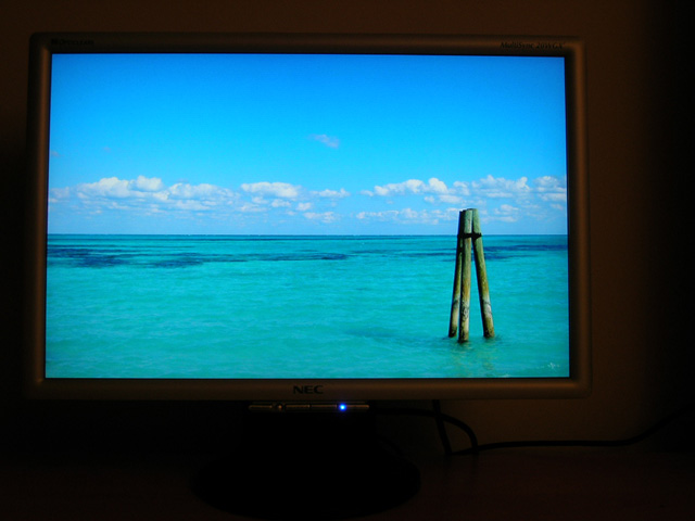
Above: OptiClear
Logo on bezel
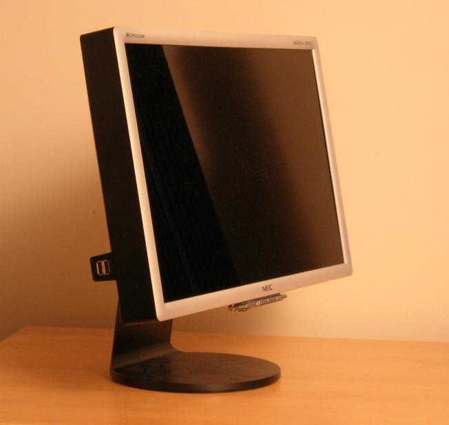
I was initially impressed with
the appearance of the screen as I unpacked it from the box, with the glossy
OptiClear coating looking very nice. The design of the screen is simple yet
sleek with the only main thing missing in terms of functionality being a height
adjustment. The screen has a basic tilt option and can be easily pivoted from
side to side, but the lack of height adjustment might be an issue potentially to
some users. Fortunately I like the screen to sit low down and so the lack of this
feature was not a problem in my use.
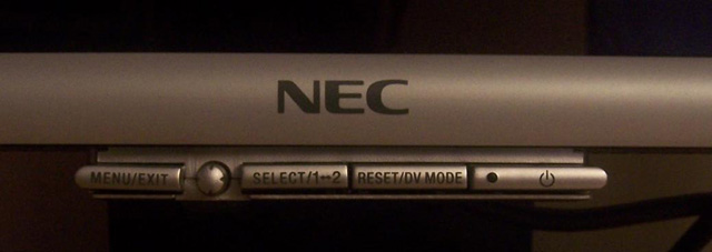
Above: The
control buttons seem a little like an after thought, and are a little flimsy
The silver bezel is reasonably
thin and rounded, but the OSD control buttons sit separate to the bezel and
almost look as if they were added on as an after-thought! While the OSD is easy
enough to navigate, I felt the selection buttons were a little flimsy which is a
shame since the rest of the monitor is very sturdy in design and feel.
Nevertheless, it's unlikely you would use the OSD buttons much after the initial
setup anyway, and the preset DV modes (text, movies etc) can be easily accessed
through the use of one button if you wish to use them at any point. Likewise
switching between DVI and VGA interfaces can be achieved through a single button
press. The small blue LED forms part of the on/off button and it's brightness
can be controlled via the OSD which is a nice additional feature.
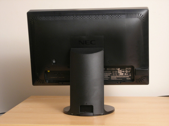
Above: Rear view
of the 20WGX2 (click for larger images)
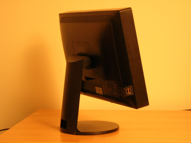
There are two USB ports located
on the left hand side of the screen, but again sadly these appear as if they
were an after though, almost looking like an extra bit has been stuck on to the
otherwise quite nicely designed screen. In normal use, these are out of sight
anyway, but it might have been nice to see them a little more integrated into
the design or more subtly hidden. Cables can be fed through the back of the
stand to keep them well hidden.
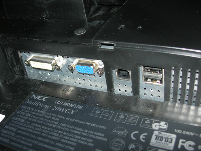
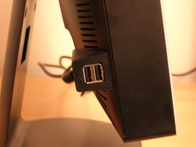
Above: Left
image shows DVI, VGA, and USB connections. Right image shows 2x USB ports on the
left hand side of the screen
Viewing Angles
As you'd expect, the S-IPS
panel technology used (labelled AS-IPS for NEC) offers wide viewing angles in
all directions and there is no noticeable colour or contrast shift until you get
to more extreme angles. No complaints here.
Above: Viewing
angles of the 20WGX2. Click for larger versions
Colour Accuracy and Quality
The NEC 20WGX2 features an
8-bit S-IPS panel capable of a true 16.7 million colour depth. An important
thing to consider for most users is how a screen will perform out of the box and
with some basic manual adjustments. Since most users won't have access to
hardware colorimeter tools, it is important to understand how the screen is
going to perform in terms of colour accuracy for the average user.
I restored my graphics card to
default settings and set it to its standard profile. The NEC 20WGX2 was tested
at default factory settings out of the box using the
LaCie Blue Eye Pro and their accompanying software suite.
NEC LCD20WGX2 - Default Settings
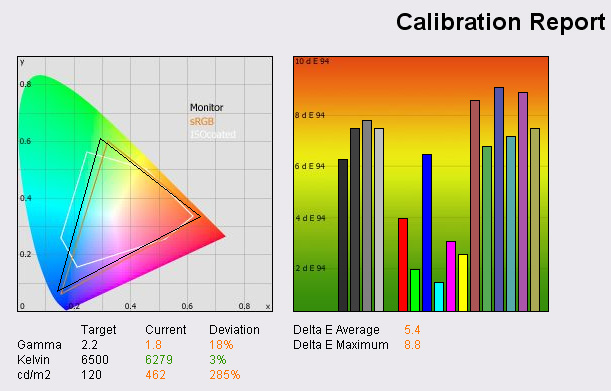
In practice, the screen looked
far too bright at default settings, although colours looked pretty vibrant and even.
There was no obvious trend towards certain shades and the OptiClear coating
really helped bring out the colours nicely. Testing with the hardware
colorimeter showed that out of the box, the screen was initially set up with far
too high a brightness, as expected from initial observations. In checking the
OSD setting, I realised the screen was set at 100% brightness, resulting in a
luminance reading of 462 cd/m2, way off the target 120 cd/m2 recommended for LCD
screens in normal lighting conditions. Gamma was also a little off, but colour
temperature was reasonably close to the desired 6500k.
The graph on the right shows
the DeltaE values for colours tested by the LaCie Blue Eye Pro. As a reminder,
the lower these bars down the Y-axis, the better, in terms of colour accuracy.
For reference, LaCie describe the DeltaE readings as:
-
If DeltaE >3, the color displayed is significantly different from the
theoretical one, meaning that the difference will be perceptible to the
viewer.
-
If DeltaE <2, LaCie considers the calibration a success; there remains a
slight difference, but it is barely undetectable.
-
If DeltaE < 1, the color fidelity is excellent.
As you can see from the graph
above, the colour accuracy out of the box is not great, with average DeltaE
being 5.4. Dark tones are particularly poor, but will be related to the extreme
default brightness setting. Black point was measured at 0.8 cd/m2 (not seen here
but available in the saved PDF report), giving a usable contrast ratio of 578:1.
Again poor black depth reading can be attributed to the brightness setting of
the screen. Note: these measurements were taken without Advanced DVM being
active.
Since most users will not want
to use the screen at a brightness of 100%, I tested the 20WGX2 again with some
basic manual adjustments. Brightness was turned down to a more comfortable level
of 50%. The LaCie test and report revealed some improvements in the colour
accuracy:
NEC LCD20WGX2 - Basic Manual Adjustments
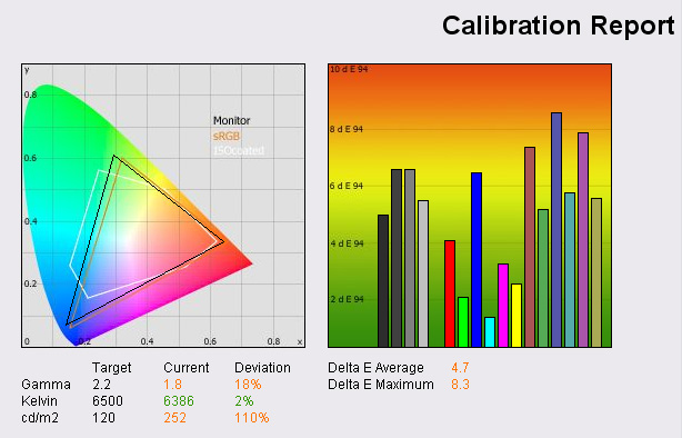
Monitor luminance was measured
at a lower 252 cd/m2 this time, but still too high for a desired 120 cd/m2
level. Obviously different ambient light conditions will mean that some users
like the screen to be brighter and some prefer a darker setting. For the
purposes of calibration though, the LCD recommended 120 cd/m2 will be used. At
this lower brightness setting, DeltaE was a little lower, with an average 4.7
reading. The screen looked pretty good to the eye in terms of colour levels,
with no obvious colour tones standing out or needing adjusting. As such, without
professional hardware tools, it would probably be hard to get much better colour
accuracy out of the 20WGX2 by using the eye only. Black depth was improved to a
reading of 0.5 cd/m2 and gave a usable contrast ratio of 504:1. Again, advanced
DVM mode was left off.
NEC LCD20WGX2 - Calibrated Results
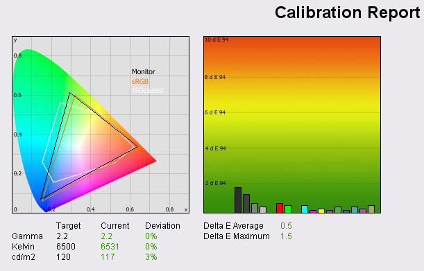
After calibrating the screen
the results were far more impressive. Gamma, colour temperature and luminance
had all reached very accurate levels. DeltaE had reached a very good 0.5 average
showing colours were being rendered extremely well. Only the darker tones
remained a little above DeltaE = 1 in some cases, but still, colour accuracy was
excellent across the board. Black depth was recorded at 0.3 cd/m2 with a usable
contrast ratio of 390:1 being offered. To the eye the screen looked very nice,
with colours feeling a little more even and brightness certainly at a more
comfortable level. The OptiClear coating again helped bring out the colour
vibrancy and offered an impressive 'feel' to the appearance of the screen.
Colours were not dulled in any way by any AR coating and the image felt somehow
a little nearer to me. It's hard to explain, you'd have to test a glossy screen
in person to appreciate it I think, but the actual image just felt a little
closer, with no barrier coating between you and the picture.
Black Depth
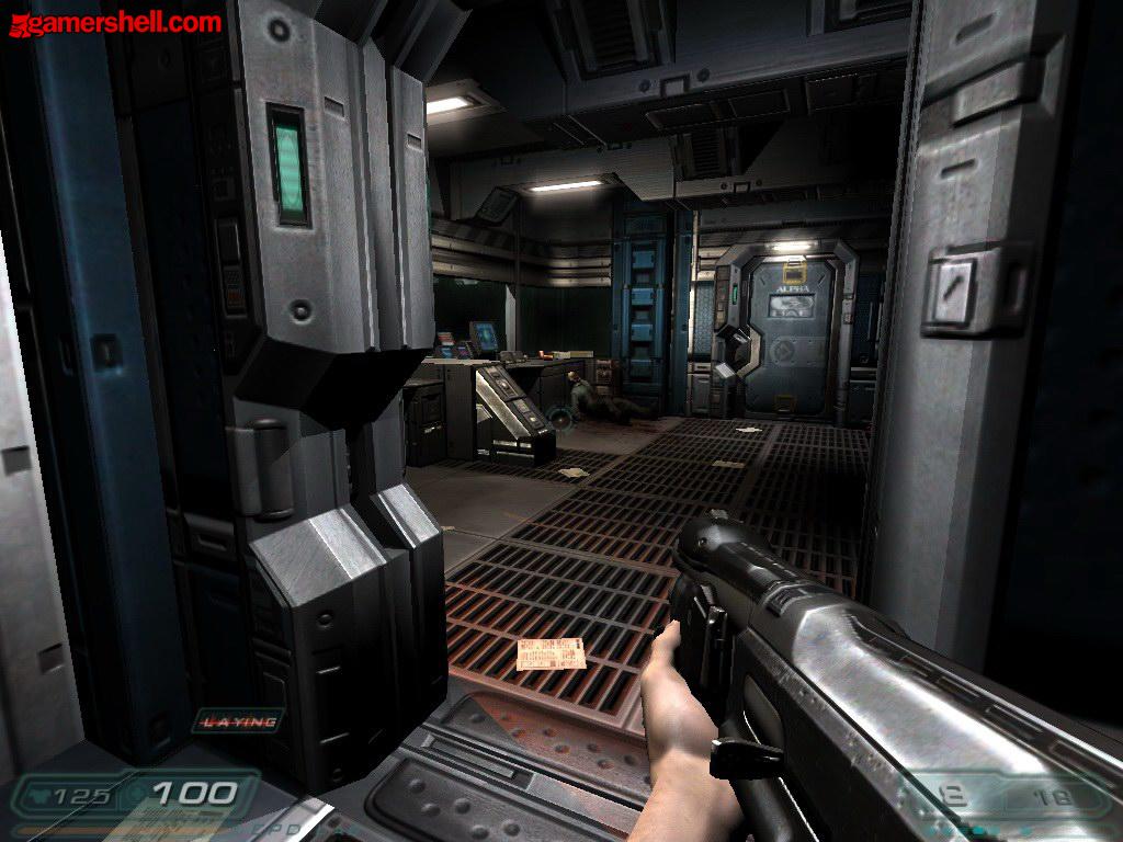
Above: Doom 3
Test shot for black depth analysis
Testing the screen with the
above Doom 3 screen shot showed the monitors ability to distinguish darker
shades as being very good. The grey shades were easily separated from one
another and overall the picture looked good on this screen. This showed some
improvements in darker shades as compared with the Dell 2007WFP which I
tested recently (in conjunction with Pureoverclock.com).
The tests above go to show that
this screen is certainly capable of very good colour reproduction if you have
the right methods for calibrating the screen. If colour critical work is
important to you, you might need to consider investing in a colorimeter since
default and basic settings cannot offer the accuracy required. With some
calibration though, the screen is very impressive in this regard, attributed to
S-IPS technology which is the choice of most professional colour critical
displays. The only slight issue is regards to black depth however as darker
tones are not quite up to matching VA variant panels as the measurements show. I
did test the screen with Advanced DVM mode on which resulted in a deeper black
reading of 0.2 cd/m2 but in normal use, and without this option turned on, the
black depth is a little behind that of VA panels I have tested. Igor Stankovic
goes into more thorough testing later in this review with use of other software
suites designed for colour calibration and analysis.
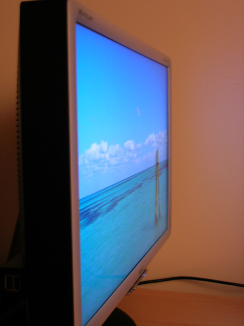
Colour Gradients
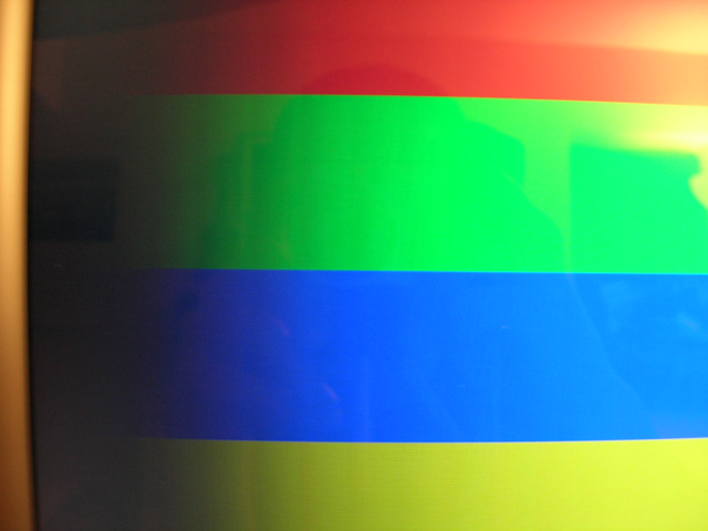
Above: Colour
gradient photo from 20WGX2
It may be a little hard to see from the
photograph, but colour gradients on the 20WGX2 were generally pretty good. There
was some slight banding evident in the darker tones, with some defined lines
noticeable. However, this was minimal and in practice I saw no adverse affects
of this. Colour gradients seemed smooth and varied in real use.
Office and Window Use
The screen offered a nice sharp
image and good PQ in both DVI and VGA mode. In fact, there was pretty much no
noticeable difference in image clarity between the two interfaces and text
remained very sharp using both connections. Interestingly, the OSD settings are
all available in both modes, including contrast. However, contrast seemed
optimal at 50% anyway (default out of the box) so there was no need to change
from this setting. Being a 20"WS monitor, the 1680 x 1050 resolution offered
enough horizontal real estate to split the screen for side by side working.
However, scroll bars were needed on most sites, and so the screen isn't quite
wide enough for side by side browsing in most cases.
Strangely the DV mode (monitor
presets) for "text" was brighter than that of the "gaming" and "movie" modes
which seems a little odd. It was also brighter than my calibrated "standard"
mode settings, and so I'd question whether this was really a usable option in
terms of presets. I'd have preferred a darker luminance setting from this preset
as compared with movie and gaming modes, something a little easier on the eye
when you have white document backgrounds to work with.
Responsiveness and Gaming
Igor has already done an
in depth analysis of this screen for many different games so I will avoid
going into too much additional detail about its performance in this regard. I
tested the screen using PixPerAn software which showed some impressive results
in the 'flag test' moving car animation.
There was minimal blur in the moving car test and no identifiable ghosting
images behind the moving object. There was no noticeable overdrive artefacts or
white halo-ing that I could see. Responsiveness in this test remained comparable
to that of the
Dell 2007WFP tested recently as well. The screen was more responsive than
the Samsung SM205BW (6ms TN Film panel) also tested in the same review however,
a good showing from an S-IPS panel again.
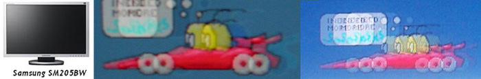


Above:
Left image shows best case example photo shot, while right hand image shows
worse case shot. Only to be used as comparative indication of responsiveness, by
no means a definitive guide to response time performance
I hooked the screen up in clone
mode with a 4ms TN Film monitor from LG, the L1932P (review to come soon!)
PixPerAn exhibited quite comparable performance, with perhaps the slight edge
going to the NEC in terms of texture blur. Both screens were impressive however.
In practice there have already
been some good tests of this screen for gaming in our
previous review, but testing the screen in GTA San Andreas showed positive
results with no obvious ghosting evident. Texture blur was also at a minimum.
The enhancements of Advanced DVM and OptiClear also helped in a gaming
environment, and the screen really was very well suited to fast movie action and
dark scenes. Colour vibrancy was again impressive thanks to OptiClear. However,
I found that dark scenes tended to bring out an unwanted reflection in practice,
either from nearby windows or lighting. This is hard to ignore in some cases,
and if you plan on playing a lot of darkly lit games then you might want to take
this into consideration. The OptiClear technology is impressive, but not always
suited to every use.
The screen features hardware
options for aspect ratio control and 1:1 pixel mapping, with selections for
"full", "aspect" and "off" available through the OSD. These will allow you to
play games at lower resolutions or retain certain aspect ratios if WS format is
not supported. The option for "off" offers you 1:1 pixel mapping and so at lower
resolutions (e.g. 1024 x 768) the game is displayed with black borders around
all sides. "Aspect" stretches the image as much as possible but maintains the
correct proportions, while "full" stretches the image to fill the screen,
ignoring any aspect ratio. The screen interpolated lower resolutions quite well
when using the "aspect" option, but some sharpness was lost.
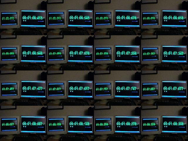
Above: Input lag measurements on
the 20WGX2 compared with a CRT
Input lag was measured using
a stopwatch program and by hooking up both models in clone mode with a CRT.
Images were captured on the cameras fastest shutter speed to see if there was
any delay between the TFT screens and the CRT.
The difference was commonly 10 - 20ms, not too drastic, but still there. For
reference, this was a little worse than the Samsung SM205BW which consistently
showed 10ms difference, but the NEC is more like the Dell 2007WFP in this regard
(10 - 20ms). In my
gaming trials I didn't notice any adverse affects of this lag, and considering
it was measured as being pretty minimal it is probably not an issue for most
average users.
Movies and Video
Testing the screen with several
DVD's, TV shows and Microsoft HD clips I actually found the screen to be better
than expected. There had been some reviews which commented on excessive noise in
movie playback, particularly on large colour masses. There wasn't anything
particularly bad in my opinion, and there was actually less noise than the
Dell 2007WFP I had tested recently. Any noise which is detectable is soon
forgotten about when watching from a metre or two away, at a comfortable
distance. The panel responsiveness was perfectly adequate for fast moving scenes
and darker shades were well rendered. OptiClear again demonstrated its
advantages and disadvantages during movie playback, with colours nice and bright
and the image looking very crisp and clean. However, dark scenes again were a
bit of an issue, with reflections being obvious and distracting. Panel
uniformity was good and there was no obvious backlight issues which are often
accentuated when watching movies with their black borders. Not an ideal screen
for movie viewing due to reflective nature of the coating, but suitable
for most light users I would suggest.
Panel Uniformity
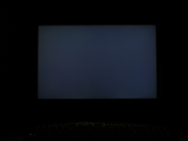
Above: Panel
uniformity test
Panel uniformity was pretty decent as you can see
from the image above showing a black screen in a darkly lit room. There was no
noticeable issues here with unevenness of backlight bleed.
OptiClear
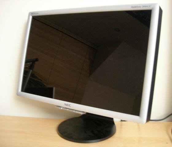
Above: 20WGX2
turned off, showing reflective nature of OptiClear coating
I wanted to take a closer look
at the use of this panel coating leading on from my observations during gaming.
The coating is quite reflective, but rather than label it as unsuitable for
certain applications, I think it's important to consider your individual uses
and lighting conditions. When the TFT is turned off, there is obvious
reflections but once turned on, these become much less obvious. In desktop use,
it's not really an issue at all, but for dark gaming (as I've mentioned above) I
found it a little annoying personally. This may not effect everyone, and after a
little time you soon come to forget about the reflections. They are there
however, and so in certain lighting conditions I would suggest it might become a
little distracting. Again this becomes an issue in darker movie scenes, with any
nearby lamps or windows become troublesome. The technology does help bring out
colours and adds to the 'feel' of the screen in many cases, but in my opinion
the coating is too reflective in some conditions. I found that the more I used
the screen, the more annoyed I became at reflections in some conditions, I think
I'm more of a fan of AR coating, but if you're in doubt as to whether you would
like a glossy type screen I'd advise you to try and see one in action first.
Acer, Sony and NEC all have glossy type screens which are quite similar, and so
should give you an idea of how the coating performs.
Conclusion
I did enjoy using the NEC 20WGX2 on the most part and
would certainly recommend it as a very good TFT. If you're looking for a screen
for gaming, this could be one of the best choices in the market at the moment.
It provides a nice size and resolution which is not too big to stress most users
graphics cards, but big enough to offer some improved screen area compared with
the 19" range which is its biggest competitor in the gaming market. The WS
format is also nice, and offers its advantages in office use as well, and is
clearly a better choice if you intend to watch any movies on the screen. The
performance was very good, with responsiveness being very impressive and the
additions of Advanced DVM and OptiClear adding to the gaming experience. Movie
playback was pretty good, better than expected, but sadly I personally felt the
OptiClear coating was a distraction in this use, especially if you watch in low
lighting conditions or are watching darker scenes. I'm sure many users would not
find this a problem, but I'd say this was probably my only criticism of an
otherwise very impressive monitor.
Further Analysis, 9 Months On...
Initial Monitor Adjustments
When playing with the contrast and brightness settings, you have to be careful
not to damage the colour shades and gradients (typically darker mid-tones).
Here is the good guidance for you. While playing with your
contrast/brightness and/or colour temperature settings and at the same time
observing the gradient from the page above, you will see how the gradient is
reacting to the changes and you can easily find the sweet spot which will
produce the less banding (if visible at all) and colour cast. Please note that
only really expensive (colour critical) monitors can display the spotless
gradients with the maximum number of exposed darkest shades from the colour
gamut.
I think that 50% contrast is optimal and brightness should not be less then 25%.
Try the "Monitor Grayscale Test Image" (first) link and you will see what I'm
talking about. Values outside of those boundaries are definitely messing up the
gradients and dark mid-tone shades. You may also try the "colour, grey and moire
patterns" from the NaviSet testing patterns. Also, please note that if you
change the monitor colour temperature, you have to adjust the
contrast/brightness again to the optimal values by using test screens. Optimal
values are not the equivalent between each colour temperature mode. When you set
up your contrast/brightness, colour temperature and RGB balance properly, you
should have same really nice, balanced and accurate colours. Also, your colour
shades will not suffer and that will bring additional benefits.
Custom DV Modes and Monitor Gradient Tests
Custom DV modes (gaming/movie/photo presets) are not the best case scenario for
the any type of colour gradients tests. The reason why I'm telling you this is
because when you activate them, the DFC (Digital Fine Contrast) engine is
kicking in and because the monitor software is dynamically controlling the
contrast, gamma and backlight according to the screen content, you may notice
the colour banding. In these cases, generally it's not related to the colour
depth on the screen. For the desktop (or any other "static" usage) you really
don't have to use them. They work very well with gaming or movie playback. As
the general guideline, colour gradients (or any other colour tests) require that
monitor operate in "native" mode, unaffected by dynamic picture control or any
other post-processing software, integrated in the panel control circuit. For the
DFC to work best, the screen has to be textured, dynamic and with "moving"
pictures. In that sense, for the gaming, video or any other task when the screen
is "noisy", DV monitor profiles are actually working very well. If the matter is
distracting, solution is simple. Just flick the monitor to standard DV mode with
or without Advanced DVM. This is native monitor profile. Even with the standard
DV mode + Advanced DV monitor will still deliver exceptional performance.
Picture should be equally good and you may further tweak the brightness and
contrast. Monitor is tweaking friendly, so I guess that everyone can adapt the
screen to their needs or simply fine tune the options in order to expose the
excellent screen characteristics.
Digital Fine Contrast engine (DFC) consists of 3 elements
-
Auto Contents Recognition (ACR) - detects the type of content being viewed
and decides how to use the contrast adjustment engine to make the most of it.
This is dependent on the mode selection in the monitor's OSD, choosing between
settings like 'Movie', 'Text', 'Games' etc. For example, in 'Movie' mode, the
DFC is enhanced for a maximum brightness and in 'Picture' mode colours are
deepened.
-
Digital Contrast Enhancer (DCE) - which reduces black luminance.
-
Digital Contrast Mapper (DCM) - Displays the image while ensuring that the
enhanced contrast is optimised.
As it's evident from the above ... loads of post-processing is going on and this
is the reason why people shouldn't test their monitors (and colour gradients
especially) when using custom DV modes. Here is my test from NaviSet (warning
for other thread readers: if your monitor is 6-bit or not fully colour capable -
you will see the banding in this picture).
OptiClear Review
OptiClear is simply a bonus for me. It's improving the colour vibrancy, image
focus, purity and overall quality. It's maybe not measurable (and this is
normal), but it's there and it's pleasant. Apart from this, something that was
rarely mentioned in the reviews (if at all) is that with the OptiClear you
really just see the image and not LCD surface (something that was always
distracting for me) and it will nicely remove all possible screen-door effects,
grainy and crystallised surface of the usual LCD panel coatings. I've always
missed the overall smoothness of the CRT screens as it's much easier and more
pleasant to the eye. When you look at the "OptiClear picture", all you see is
the image and no surface. Image is just floating there, with a great sense that
panel is just the window to another world outside. It's more immersive for
gaming (even for video watching) and it's really introducing that extra vibrance
to the spectrum. Sometimes, is really like there is no barrier between you and
the liquid crystal.
One interesting point about the NEC brightness. Yes, 20WGX2 is very bright ...
but I would say that brightness is not unpleasant, even when monitor is tuned at
very high (let's say 60% - 70%) brightness. OptiClear is probably contributing
factor for this, as any other panel coating (or the panel itself) will make such
brightness simply overwhelming, unpleasant and unbearable. With NEC, it's going
very well ... especially in gaming and video.
Regarding reflections, I would say that any nearby window, with the
"controllable" ambient light (blinds or curtains) shouldn't be a problem. Some
users also reported that side window was not problem for them. Also, you may
have more reflections with the opposite window directly facing the monitor
during the very bright and sunny day ... but again if it's controllable you
shouldn't have much problems. Also, if you have the desk lamp, just behind the
monitor you shouldn't have problems either. I think that OptiClear is probably
around 20% - 25% more reflective than traditional "glass" coating of the CRT
monitors and TV screens. It's hard to tell. For example, I have a window
just opposite the screen and can't say that it was distracting for me to the
annoying extent. Even during the very bright and sunny day - when the window
blinds were properly adjusted - I could finish my work without any major issues.
Also, after reading many responses from the users around, honestly I can't
remember that someone seriously complained about the reflections. In that sense,
we may possibly conclude that for the majority of users out there it's pretty
much OK. An overly bright room or intensive ambient light can be problematic for
any screen, including the ones with AR (anti reflective) coating - you may have
big and bright white spots. Picture is losing the fine details, deep black,
contrast ... and it can be quite distracting too. A bit like watching a movie in
the cinema with the lights on!
Also, when the screen is off it's much more reflective. When you power on the
screen, panel illumination is also dimming the reflections. All reviews around
are showing the powered off screen, and that is definitely misleading to some
extent.
So, you see ... I tried to elaborate this issue slightly more than what you may
find in the reviews around about the famous glossy factor. Such epidemic glossy
factor reservation in the reviews around is disturbing, to say the least. They
are either ignorant or simply involving their personal preference. It's
definitely not the problem for the majority of users out there and to kill the
monitor review score just because of the coating ... is just nuts, as there are
many positive things too. It's simply exaggerated and not elaborated properly.
It seems that we (especially other reviews) forgot the days of a CRT monitors so
that glossy/reflection factor is like new phenomenon now. I wonder how could
they live with the CRT at all in the past ... so that OptiClear is now globally
bashed and suddenly AR (anti reflective coating) is the new "standard". Some
people (including myself) don't prefer AR coating and especially if it's lower
grade quality. It's hazy, grainy, crystallized surface and screen door effect is
much more pronounced. Even if you have the intensive light source behind the AR
coating, you will have one big messy white spot because of the way how the light
is "reflected". On the other hand, OptiClear for example is actually absorbing
the portion of light hitting the screen and at the same time allowing the screen
image to be displayed without distortion.
Colour Quality and Calibration Review
Maybe it's time that I post my mini report about the 20WGX2 colour quality and
calibration. Firstly, here are the Eye-One Display2 (referred to as "EOD" in the
further text) device pics:
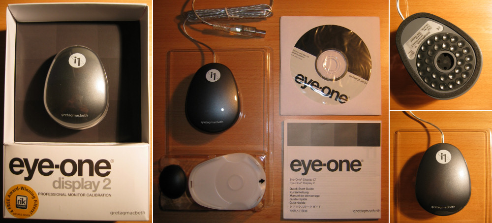
Very
simple packaging. No fuss. It seems that they scaled down the packaging costs
and EOD calibration device itself had few changes and that includes the surface
finish and 2 colour print only. Essentially, if that will keep the costs down
compared to original Gretag Macbeth tool, I don't mind really. Apart from the
visual changes, technical functionality of the EOD device is completely the
same. On the pics, you may see the packaging and the packaging content itself.
That includes the EOD device (top/bottom side), ambient light measurement
(attachment), counter weight attachment (for the LCD), software CD and manual
itself.
On the device bottom side picture you may see small suction cups and they are
used to attach the EOD device securely to the monitor itself. Manual itself is
stating that this attachment method is not recommended for the LCD monitors
(because of the suction pressure on the LCD panel itself) and that counter
weight is recommended method, so that device is just resting on the LCD panel.
However, as 20WGX2 panel surface is hardened with OptiClear, I didn't have
problems to use the little suction cups, as this attachment method is much
better and flexible in my opinion.
Here is the EOD device in action:
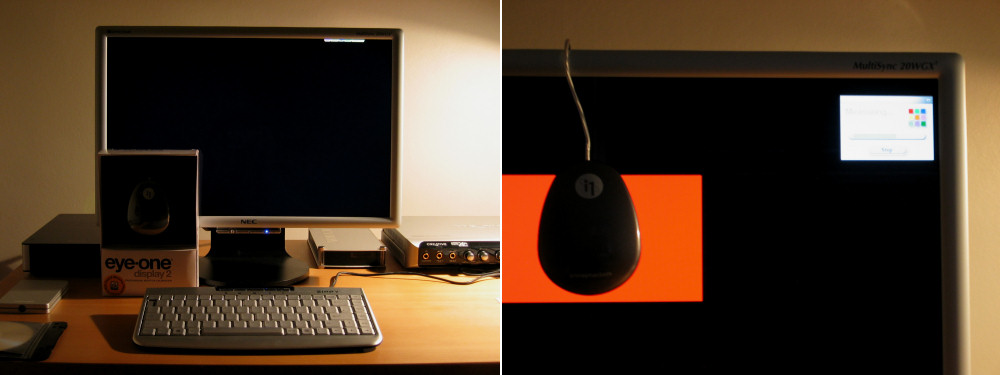
I
included the first picture (my desktop) so that you have an idea about my
ambient light. Measured ambient light luminance was around 12 lux (2470K) which
is half way to the recommended D50 (5000K/less then 32 lux) ... but as I'm not
using this monitor for colour critical work, it doesn't matter that much.
Solution for this is that you have special desk lamps which are emulating the
daylight and/or optimal ambient light for the colour critical work. Anyhow, as
you may see, my ambient light is pretty much dimmed and just look at that 20WGX2
black uniformity! I have to remind you that monitor is actually "ON" and that
black desktop background is in place. Just give the 20WGX2 tiny amount of the
ambient light and OptiClear will greet you with some impressive blacks and more
importantly fantastic picture contrast and depth to play with. That small
enlightened area at the top of the screen (on the first picture) is StartDock
ObjectDock. I like my desktop clean and black with occasional menu pop-up.
Considerations and
Set-Up
Finally,
let's see the colour readings and calibration results. Few things I would like
to mentioned about the testing methodology:
-
For
the stock set-up and measurement I was using the default 20WGX2 monitor driver
with the included and activated nl20wgx2.icm colour profile.
-
Measurement and calibration was done in total darkness and without any ambient
light. This is my preferable set-up so that we can avoid possible errors
because of the screen reflections or the influence of the ambient light. Yes,
EOD device (especially suction cups method) when attached plane to the monitor
is sealing off the part of the screen where it's resting ... but that again
you can't be 100% sure that just tiny portion of ambient light may get in.
Sometimes, it's even recommended that you cover the monitor during the
calibration process.
-
Sufficient warm up time is allowed. In my case ~ 2 hours.
-
I
didn't changed the monitor OSD brightness from the default 50%. This may sound
strange, but after further consultation with calibration software developer
and few people around, I decided not to bother with contrast adaptation. As
contrast control (OSD) of an LCD monitor works completely differently and it's
used in a different context for CRT's and LCD's, there is no need to change
the contrast settings. Contrast should be preset to the default (factory)
value before the LCD calibration process. In that sense, I just fine tuned the
desired luminance and RGB balance from the monitor OSD and contrast was left
at 50% (default value) ... and I still had great calibration results and PQ.
-
I
decided to make 3-D gamut-compressed icm colour profiles. Essentially, such
profiles are not clipping out the colours outside of the saturation gamut
range, resulting in very good colour simulation. It will let you see colours
in the correct hue even if they are outside of the monitor's saturation
gamut. From early tests, I can tell that gamut-compressed monitor profiles
really do make a difference and such difference is not just pronounced on
out-of-gamut colours, but also on boundary colours that are very near or just
approached the limits of monitor saturation.
-
All
icm calibration profiles are V4, LUT based with 16-bit depth and CAT02
chromatic adaptation. This is more (far more) then enough for 20WGX2 and
strictly speaking such profiles are probably a perfect match for the monitors
who are supporting the larger internal gamma lookup table (like NEC 90 series
with the 12-bit LUT support).
-
"L*"
(L-star) calibration gamma curve is used to give the smoothest results
(especially tonal gradations from black to white) ... and you can tell because
gradation smoothness, black and shadow details are also excellent, even after
calibration. With L* curve, a gamma preset doesn't makes sense, because this
curve changes between gamma 1.5 and 2.6!
-
I
decided to use CIELAB dE94 as it's more accurately adapted to our visual
system and it's somewhat more common these days.
-
All
tests on 20WGX2 are done in standard DV mode
A few notes about the charts. They include the dE94 numeric and graphical
representation, reference and achieved Lab colour space (with dE94 numbers for
each colour sample). Additionally, you have maximum achievable white point (with
delta values when compared to the target settings), minimum black point and
contrast ratio with the desired calibration option or just with the default
measurement (without the calibration). The graphical representation shows how
accurate colours are based on DeltaE readings. LaCie describe this using the
following ratings:
-
If DeltaE >3, the color displayed is significantly different from the
theoretical one, meaning that the difference will be perceptible to the
viewer.
-
If DeltaE <2, LaCie considers the calibration a success; there remains a
slight difference, but it is barely undetectable.
-
If DeltaE < 1, the color fidelity is excellent.
What you need to look for to
summarise is how low the bars are towards the vertical axis. The lower the
better in terms of colour accuracy. Graphs below show
default colour results (at various brightness, contrast, white point and DV
settings) on the left, as compared with calibrated results on the right.
The Tests
50/50 brightness/contrast, native white point
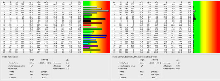
ICM profile
HighRes
Out-of-the-box colour accuracy (left hand) is really acceptable! and post
calibration graph (right hand) is pretty much fantastic. As you may notice, at
50% brightness you have ~ 280 cd/m2 white luminance, and ~ 0.45 cd/m2 black
luminance. This is probably preferred set-up for the people who appreciate
higher brightness but at the same time would like to keep the native colour
profile and stock configuration settings. Interestingly enough, at 100%
brightness/50% contrast/native white point, minimum measured black luminance was
0.68 cd/m2 and max measurable white point was 460.2 cd/m2.
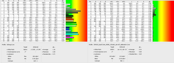
50/50 brightness/contrast, native white point,
advanced DV ON
ICM profile
HighRes
This one is very interesting! It seems that with Advanced DV mode, stock colours
are more accurate! Look how nicely the monitor is calibrated with Advanced DV
and "LCD recommended" 120cd/m2 brightness. Overall colour balance is very good.
That 0.18cd/m2 black luminance is fantastic too! followed by achieved 654:1
contrast ratio. Now, what is interesting here is that as soon as you activate
the Advanced DV mode, brightness is going to the very pleasant (my favourite)
100-120 cd/m2 levels. Even if you calibrate the monitor without Advanced DV and
at 120cd/m2 luminance with 6500k white point (as shown in the next chart) black
luminance is still around 0.3 cd/m2. In that sense, only Advanced DV will give
you those deep and velvety blacks. This is my favourite calibration profile for
games, video and multimedia.
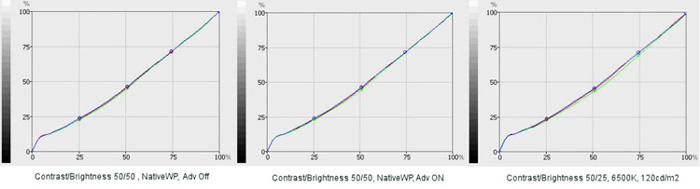
25% brightness, 50% contrast, 6500K white
point, 120cd/m2, Advanced DV Off
ICM profile
HighRes
Here is my second preferred calibration profile for desktop sessions,
photographic and colour work. Target 120cd/m2 brightness and 6500K white point.
As I mentioned above, even at this white luminance you can't reach the Advanced
DV mode black depth. In spite of this fact, perceived black depth is still
excellent. First (starting) chart on the left is the default sRGB (6500K)
monitor colour profile @ 50% brightness. As you may notice, very good stock
colour accuracy (again) and this time even better then with the native white
point. When properly calibrated, this mode is probably perfect for the
photographic work. Colours are still extremely deep, accurate and nicely
saturated & balanced, despite the low luminance factor. I could easily spot and
differentiate the RGB 3,3,3 and 4,4,4 black point ... and this is already very
good for 20WGX2. Apart from the OSD 25% brightness, calibrated RGB balance via
monitor OSD is: Red: 84.7, Green:79.2, Blue: 86.2
Gamma tracking (for each profile)
Obviously, there are slight deviations from the ideal (theoretical) curve, but
for such multitasking monitor and in this price range I think that results are
excellent! It's nice that NEC is giving us the good colours, even for this
monitor which essentially is not part of the colour professional 90 series. I
don't see any reason why (after proper calibration) people shouldn't use this
monitor for semi professional colour work.
Colour gamut before and after calibration
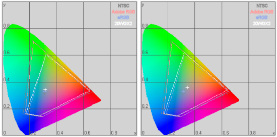
After proper calibration, 20WGX2 is even crossing the sRGB boundaries. For your
reference, I included the NTSC, Adobe RGB and sRGB colour space. Again, default
settings on the left, calibrated on the right.