Response Time Testing – Pitfalls, Improvements and Updating Our Methodology

Introduction
In the last few months we’ve been thinking a lot about response times – and when we say that, we mean more so than normal for someone who tests monitors and their performance regularly. A couple of excellent YouTube videos over the last few months triggered this thinking and posed some interesting questions about response time measurement – we will link to them and talk about them in more detail later, but we don’t want to pre-empt our introduction and background before we get that far.
This article will talk through everything you might want to know about response time testing, consider if there are ways to improvements accuracy and data and talk about how different review sites measure these things and how you might compare results from one site to another. It’s a more technical article than some others, but hopefully we’ve made it as clear as we can. If you find it too heavy going we’ve also included a TL;DR summary at the end with the highlights.

If you enjoy our work and want to say thanks, donations to the site are very welcome. If you would like to get early access to future reviews please consider becoming a TFT Central supporter.
Terminology

Before we get in to testing methodology we should start by covering some common terms you will hear discussed when it comes to response times and gaming performance for displays. This will hopefully give you a bit of background before we get in to the technical stuff, or perhaps answer some common questions you might have when these terms are commonly used. Some of the following terms seem to be a little interchangeable in the market, but we will explain what we consider each term to mean, and how we refer to them in our reviews.
Response Time (G2G)

We will put this in simple terms, obviously there is a fair bit more to it technically but this is the gist of it: An LCD display a panel is made up of a certain number of pixels which corresponds to the resolution. So a 1920 x 1080 resolution panel would have 2,073,600 pixels in total. Generally you have a liquid crystal display (LCD) panel sat in front of a backlight unit that lights the screen up. Each pixel is like a tiny little shutter that closes to shut out the light when it is asked to go black, and opens fully when it needs to turn white. A voltage is applied to the pixels depending on the “orientation” it needs to make and the varying degrees of how open or closed the pixel is provided all the shades of grey in between. Red, Blue and Green (RGB) colour filters are applied in front of those pixels to produce the colours of the screen. We won’t go in to that more, for our purposes we are considering the changing pixel brightness or grey levels.
The response time, simply put, is the time it takes for the pixels in an LCD display to change from one brightness level to another. These transitions will vary depending on the brightness level they are changing from and to, and are measured in changes between grey shades. This is why you will see terms like “G2G” (grey to grey) discussed when considering response times. We will talk about how response times are measured in a lot more detail below.
Response times are typically quoted in G2G figures although you need to take manufacturer specs with a pinch of salt as they are usually referring to the best case figure (hence all the adventurous “1ms” type marketing), or perhaps quoting figures that are only possible in unrealistic or unusable situations. Measurement of response times by third party reviewers like ourselves will give you a much better view overall.
Generally speaking the lower the response time, the better as this means the pixels can more quickly change between one shade/colour and another, helping to keep the image free from artefacts and problems discussed below.
Moving Picture Response Time (MPRT)

We won’t go in to much detail about this here as it’s not really the topic of this article. You might want to read our short article about what MPRT is and what it represents. This spec is not really about response times in the sense that we are discussing here, it relates more to the use of blur reduction backlights and the improvements they offer in the clarity of the moving image and is a separate topic. We mention it so you can be on the lookout for manufacturers quoting MPRT figures instead of G2G.
Blurring

Blurring is an issue on all LCD displays to one degree or another, including on OLED displays in fact. It is caused by the way these kind of displays operate as they are “sample and hold” type displays. You might want to read our more detailed article about blur reduction backlights that goes in to this in a lot more detail, but basically the way the human eye tracks and perceives motion on LCD displays leads to blurring on the image. This is influenced far more by refresh rate than it is by response times, and really the task of the pixel changes and response times are to keep up with the increasing frame rate demands of high refresh rate displays. You will see significant improvements in blurring levels moving from a 60Hz screen to 120Hz for instance, and then smaller but still noticeable incremental gains as you increase higher to things like 240Hz and even 360Hz. Another way to reduce perceived motion blur on LCD displays is through the use of blur reduction backlights (see link above).
Ghosting

This one is a bit more linked to the main content of this article. In situations where the response times are slow you may even get trailing “ghost” images in content that look like faint versions of the image you are looking at. This is really a more extreme version of motion blur but is more down to the pixel response times being too slow, than being just related to how the human eye tracks the motion or the refresh rate. Ghosting can sometimes be severe and is one of the key things we look for response times to help reduce.
Smearing

Example image showing black level smearing from a VA panel indicative purposes
Smearing is, as the name implies, the appearance of the image or certain colours being smeared across the screen. It creates more noticeable trails of colour and can be particularly problematic when refresh rates are high. Smearing is generally caused when the response times of the panel cannot keep up with the frame rate of the display. For instance a 144Hz refresh rate will send a new frame to the screen every 6.94ms (1000ms / 144 = 6.94ms) and so to keep up with these frames the response times need to be reliably and consistently faster than this. If they are not, or there are too many pixel transitions that cannot keep up, you get additional smearing on moving content. As refresh rate increases, that demand on response time grows. A 360Hz refresh rate needs response times to be reliably 2.78ms G2G or better!
In extreme cases the response times are not at all fast enough and so high refresh rate modes might even become unusable, or look worse in practice than the lower refresh rates. Measuring response times and looking at “refresh rate compliance” as we do in our reviews can help identify problems here, as can real life usage and motion tests or course.
A fairly classic and common form of smearing you might hear talked about is “black level smearing” which plagues many VA technology panels. On those panels the response times when changing from black to grey are often very slow, and so they cannot keep up with the frame rate properly. This leads to common black smearing on moving content, as shown in the example image above. This is often most problematic on darker backgrounds as well where the changes are between black and dark grey shades. This doesn’t impact all VA panels, and we specifically rate screen performance and look at the level of black smearing on those displays in our reviews.
Overshoot (aka Inverse Ghosting)

Example image showing noticeable pale overdrive halos
Overdrive is a technology used to boost the speed of pixel response times. It involves providing an increased voltage to the pixel to encourage it to rotate and change quicker than it would otherwise. This is a great method for speeding up response times across different transitions. In situations where that voltage overdrive is applied too aggressively, or poorly controlled, it can lead to overshoot artefacts. This is where the requested shade is exceeded in error, before settling back down to the colour it should have been.
We will show what this looks like when measuring response times later in this article. Basically though the overdrive impulse is too strong and so it misses the shade it was aiming for. This can lead to the presence of trails, halos or “coronas” behind moving objects which can actually be a lot more distracting than blurring and ghosting would have been with slower response times. The trails are either pale and bright or dark depending on where the overshoot is occurring. Our testing discussed below helps identify these levels and quantify the level of overshoot. Some manufacturers introduce such aggressive overdrive modes for the sake of trying to get super-low response times that the overshoot becomes so severe that the mode is unusable.
Motion clarity

Example pursuit camera photos capturing real-life perceived motion clarity of a monitor
This is probably the most important consideration for a display – how clear and sharp does motion look to the human eye. Motion clarity will be influenced by a number of factors including the panel response times, refresh rate, overshoot levels and whether any additional “blur reduction” methods are added to the screen. Motion clarity is all about how the human eye perceives motion in real use. One of the simplest repeatable ways to capture this and demonstrate it in reviews is to use a pursuit camera setup and a specific test pattern like this popular TestUFO at Blurbusters.com. A pursuit camera involves a camera moving at the same speed across the screen as the test pattern, and can capture a very good representation of how the motion looks in real use to the human eye. We include pursuit camera photos in our reviews to help capture this. Ultimately the quantitative data like response time measurements etc provide a good guide towards how a screen might look, and can be used nicely to compare between different models. But ultimately the real-world usage and appearance is what matters. Capturing both helps provide a complete picture.
How Display Response Times are Measured
We should start by looking at how display response times are measured in general. To measure a displays response time a photosensor device is attached to the screen and used to track changes in the brightness levels. A special software program is used to simulate the changes between different shades from the full “grey to grey” (G2G) range of 0 (black) to 255 (white). From there, the photosensor measures the brightness change and converts it into a voltage which is passed to an Oscilloscope.
We use an ETC M526 Digital Storage Oscilloscope supplied to us by ETC Ltd

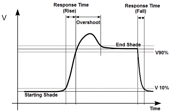
The oscilloscope and accompanying software produces “oscillogram” graphs such as the example shown above which allow us to observe and measure the response time of the pixels, and determine how quickly the pixel changes from one shade to another. Depending on the scale used on the oscilloscope, the grid lines can be used to calculate the response time. Along the horizontal X axis is time and along the vertical Y axis is the brightness of the display, recorded by the photosensor and converted here on the graph in to a voltage.

The graph is interpreted as follows. The lower flat line marked here with the blue line is the starting darker shade, and the top red line is the final lighter shade being tested. The vertical curved parts of the green graph signify the response time as the pixel changes from one state to another. The upwards curve is what is called the rise time (i.e. the change from the darker shade to the lighter shade), and the downwards line is the fall time (i.e. the change from lighter to darker shade).
The speed of these rise and fall times is part of what we will want to measure and will vary depending on a number of factors. These might include the panel technology, the overdrive levels used and the refresh rate for instance. The above graph shows a fairly neat response time oscillogram with a pretty straightforward curve. What we are looking for here is for the rise and fall times to be as quick as possible (without leading to errors) as this allows the panel to draw the images as quickly as possible and avoid things like blurring, smearing and ghosting we talked about earlier. So the lower the response time, the better.

You can then use the vertical grid lines within the software to mark the interception points where the response time curve crosses the horizontal lines. The software tells you the distance horizontally between these two vertical lines, which is the total response time it takes to change from one shade to the other. We will talk about the thresholds that can be considered when building in a reasonable tolerance to these measurements in a moment.

The same process can be followed for the fall time as well of course for the downward slope of the graph. The software takes care of most of these calculations for you to speed up the process.
Overshoot and Response Time Errors

What might be more typical though is a graph such as that shown above. You may note that the rise time actually shoots a fair way above the required level before dropping back down with a small peak on the rise time. The response time part of the curve might be faster than it would be otherwise but that is not necessarily a good thing always. We have marked this overshoot between the blue and red lines on the graph. The fall time may also do the same thing (although not in this example), dropping a little too far before it levels out at the desired shade.
This is what we call “overshoot” and is caused by the panels overdrive impulse, and where the voltage applied to the pixels causes the shade requested to be surpassed in error before it stabilises back to where it should be. Overshoot can lead to visual artefacts including halos and bright and dark trails on moving content as we talked about earlier. This may vary significantly from one screen to another as well and the peak may be much higher than this, depending on the level of overdrive impulse being used, how aggressively it is applied and how well the internal electronics are controlling the impulse. The lower the overshoot the better of course. When you get overshoot on the rise time (changing from dark to light shades) then this results in bright and pale halos and artefacts in practice. Where the overshoot is on the fall time (changing from bright to dark shades) it can lead to dark halos and artefacts.
Using a reasonable tolerance – the traditional 10 – 90% standard
We should also talk about the traditional way in which a reasonable tolerance threshold was built in to this process. It is standard in measurements like this to build in a small reasonable tolerance at the top and bottom to account for things like noise in the measurements, but also because in the instance of measuring displays response times it is not necessarily required that a pixel transitions the whole way for it to look like it has changed to the observer. In other words, the pixel only need to get “most of the way” there for it to be “close enough”.

The threshold has pretty much been standard for as long as we can remember, and is 10% at either end. This creates the 10 – 90% threshold and it is marked on the graph above as an example.

So what we are really measuring then for the pixel response time is not the time it takes to go fully from the base line (dark shade) to the top line (light shade). Instead it is the time once it has had a small head-start and reached 10% of the desired change (marked by the blue line) before it then reaches 90% of the change (marked by the red line) which is deemed “close enough” to the end point. The response time is therefore the time between the two vertical red/blue lines on the above graph.
The 10 – 90% threshold has been used for all manufacturers (producing the LCD panels themselves), display manufacturers (the actual brands like Asus, Samsung etc), monitor hardware manufacturers and for reviewers like ourselves who have access to the necessary hardware and software to measure these things independently. We’ve been doing this for over 8 years now. You can see below for example the explanation of response time measurements taken from panel spec sheets from LG.Display and AU Optronics, two of the leading panel manufacturers in the market. Both use the 10 – 90% threshold.

Above: explanation of how response times are measured in LG.Display panel documentation

Above: explanation of how response times are measured in AU Optronics panel documentation
Defining an Overshoot Measurement Standard
There is no defined standard for measurement of overshoot by the panel manufacturers, and they don’t provide any spec or measurement for this in their documentation. The way we have always done this, and other reviewers follow the same method, is to calculate how much the brightness overshoots the desired shade as a percentage. So in this example above for instance the voltage difference (shown on the Y axis) between the bottom green line and the top of the peak is 1.843V, whereas the voltage between the base green line and the top green line is 1.137V. So as a % this is 62.1% more than it should be. This is the overshoot error. We categorise these errors as follows, again a common scale used elsewhere in reviews:

Overshoot errors start to become evident in practice when they reach above about 15%, and become very obvious and problematic at about 20%. Anything above that is usually too distracting to use so we just stick with the horrible red colour in our scale! We will also consider the overall overshoot appearance and test this with motion tests in practice before awarding the screen a rating level in general. We will talk about how we are going to measure gaming performance later in this article.
That leaves us then with the following summary which is how we and many others have measured and reported on response time behaviour for over 8 years now:
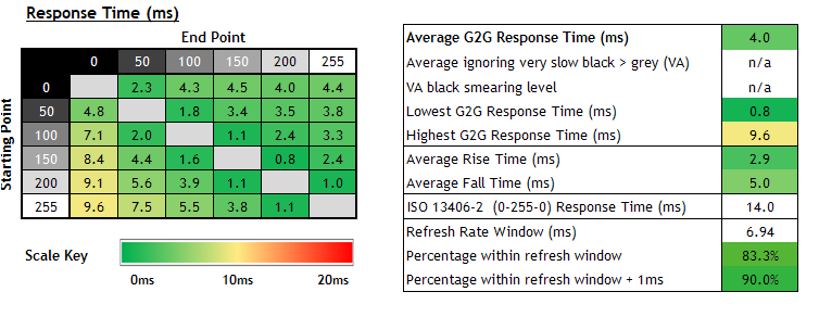
Interpreting the Response Time and Overshoot Tables

We’ve removed all the summary stats and figures we normally present in our reviews as we wanted to briefly explain how to interpret the tables or “heatmaps” that are produced from all these measurements. The above are for explanation purposes only and not representative of real measurements.
The table on the left captures the response times. You can see the starting shade on the vertical Y axis (i.e. the grey shade we are changing from), and along the horizontal X axis is the shade we are changing to. So the first green cell with 5.3ms recorded is a change from 0 > 50. The last in row 1 is a change from 0 > 255, and so on. The upper right hand half of the table are the rise times, while the bottom left hand section are the fall times. Each measurement is colour coded on the scale provided. The same thing can be said for the overshoot table on the right, where each transition is given an overshoot % rating and colour coded according to that provided scale. Lots of green is a good thing, lots of red is a bad thing.
Accounting for Gamma When Measuring Response Time Behaviour

Thumbnail image taken from a5hun’s excellent YouTube video which first raised this question
It began with a really interesting video posted by a5hun on YouTube which we would recommend watching. This video carried the tag line that it would talk about “How LCD Response Times are Measured, and Why 10% to 90% GtG Measurements are Moderately Deceptive”. We’ve been thinking about the output of that video since it was published in October 2020, running testing of our own and considering how we might update and improve our testing methodology for the future if we found it necessary. The video was later followed up by another excellent one from Hardware Unboxed, having looked at the proposed changes originally suggested by a5hun and considering how they will update their testing process.
As we’ve been thinking about this topic and working on this article we have spoken to both channels to share thoughts and bounce ideas around, so our thanks go out to both teams for their thoughts and comments.
If you enjoy our work and want to say thanks, donations to the site are very welcome. If you would like to get early access to future reviews please consider becoming a TFT Central supporter.
Gamma Introduction
You’ve probably all heard of gamma from our reviews, but what is it? In simple terms gamma can be described as how smoothly black transitions to white on a digital display. It is often associated with a number like 1.8, 2.2 or 2.4, and this number represents the shape of the curve from black to white, or from white to black. Some typical gamma curves are shown below:

Image courtesy of BenQ.com
BenQ provide some useful information about gamma that we will quote from their article below in part as it is easy to follow and explains it well:
You may wonder why a standard gamma curve is defined as gamma 2.2 (note: sRGB gamma is very close to 2.2 and often referred to). The main reason is because the human visual system does not operate in a linear way. It is capable of identifying more subtle differences in darker tones than it is in brighter tones. It is much more sensitive to changes in dark tones than we are to similar changes in bright tones. There’s a biological reason for this peculiarity: it enables our vision to operate over a broader range of luminance. Otherwise for example the typical range in brightness we encounter outdoors would be too overwhelming.

Image courtesy of BenQ.com
Let’s take a look at the figure above. Along the bottom row, linear intensity represents the intensity increase from black to white in a linear fashion. At the top row, visual encoding represents the intensity increase from black to white in a power-law fashion where a 2.2 gamma curve has been applied. Note that between 0.0 and 0.1 there is a big visual gap in linear intensity in the bottom row whereas it is much less apparent between 0.0 and 0.1 in visual encoding in the top row. And from 0.9 to 1.0 in linear intensity, the difference is barely perceivable, whereas it is more perceivable in visual encoding. The 2.2 gamma curve creates more subtle changes between dark shades to account for the human visual system.
Note that gamma 2.2 is the recommended gamma for monitors and also for sRGB / DCI-P3 in displays, and so is the most commonly used gamma in real use. Many screens will come factory calibrated to this gamma and our reviews will test relative to gamma 2.2, and calibrate if necessary to reach this level.


Images of Gamma 1.0 (on the left) compared to Gamma 2.2 (on the right). Image courtesy of BenQ.com for demonstration purposes
So how does the gamma curve impact overall image quality or perception? Gamma 2.2 delivers a balanced or ‘neutral’ tone between highlights and shadows, and you can distinguish the greys easily in between. Gamma 1.0 is an interesting curve to look at. This is a 45-degree straight line relationship between the input signal and output luminance. This is also a ‘by-pass’ scenario where no processing is done on the display end. So you will see a very bright and ‘flat’ image, where almost no contrast is present, such as the example demonstrated above.

Images of Gamma 1.8 (on the left) compared to Gamma 2.2 (on the right). Image courtesy of BenQ.com for demonstration purposes
Gamma 1.8 was very popular due to Mac OS. The gamma 1.8 curve produces slightly brighter images than gamma 2.2 so sometimes it is more preferred in some cases. However, since Mac OS X 10.6, gamma 2.2 has become the standard gamma curve for Mac OS as well. An example of gamma 1.8 versus gamma 2.2 is illustrated above.

Images of Gamma 2.4 (on the left) compared to Gamma 2.2 (on the right). Image courtesy of BenQ.com for demonstration purposes
Gamma 2.4 is widely used in the movie and TV industries due to the Rec. 709 standard. The slightly enhanced contrast brings out the saturation of colours and stimulates viewer perception and preference. However, the overall brightness of images may be lowered. An example of gamma 2.4 versus gamma 2.2 is illustrated above.

Images of Gamma 2.6 (on the left) compared to Gamma 2.2 (on the right). Image courtesy of BenQ.com for demonstration purposes
Gamma 2.6 has started to gain in popularity because of the latest DCI-P3 standard. DCI-P3 is endorsed by many newer digital cinema theatres. With a gamma 2.6 curve, images definitely look darker but very saturated. And as this is the effect required by directors, DCI-P3 needs a gamma 2.6 curve. An example of gamma 2.6 versus gamma 2.2 is illustrated above. Note that a gamma of 2.6 is applicable for DCI-P3 theatre production, but DCI-P3 in displays is still aligned to gamma 2.2.
The Problem with the Traditional 10 – 90% Tolerance Levels and Gamma

If we think back now to the explanation we provided earlier and the common 10 – 90% threshold rule applied to measuring response times there is a potential problem area here, and it is related to display gamma. If the above graph represents a transition from black (RGB 0) to white (RGB 255) for instance, then we need to consider what the actual grey shades RGB values are for the 10% and 90% threshold captured on the graph as voltage.

The transition we are trying to measure here is 0 to 255, so black to white. The 10 – 90% threshold might seem like a small reasonable amount of wiggle room plotted on the graph, but the voltage measurement is not linear while the display is operating with a 2.2 gamma (or any other gamma curve for that matter).

Plot of measured voltage for each RGB value of an example screen configured at gamma 2.2
To start with we can measure the voltage level that corresponds to each RGB value from 0 to 255 and from there work out what these 10 – 90% voltage thresholds actually link back to in real RGB values you would see. For instance we have taken a measurement of the voltage reported in the software at each RGB step from 0 – 255 and plotted them on the above graph which creates a “response gamma” curve. You can see that this is not linear. As you get in to darker tones (towards RGB 0 which is black) there are much smaller changes in the voltage reported in the software for each change in RGB value, whereas as you get towards RGB 255 white at the top end, each RGB step has a larger change in the reported voltage.
Let’s look at this relative to the actual RGB shades we would like measure if we are wanting to accurately measure how long it takes to change from one colour to another, and so that the measurement relates back visually to what we see.

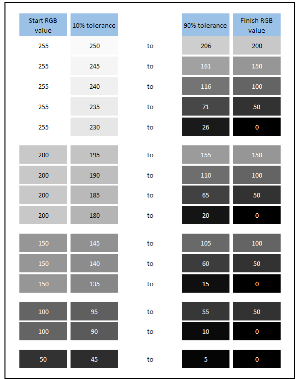
Desired 10 – 90% tolerance levels considering actual RGB values
When we are measuring 0 – 255 for example as a transition, if we were sticking to a 10 – 90% tolerance but in the actual RGB values that you would want see with the human eye, we really need to set those threshold lines at RGB 25.5 (or rounded down to RGB 25 as you can only have an integer for an RGB value) for 10% above RGB 0. You would then also be trying to get to RGB 229 for 90% of the way towards 255. This is demonstrated on the image above showing the actual RGB values we want to measure from and to ideally if we allow for a small 10% tolerance at either end.
You can see that there is a small difference in perceived black/dark grey and white/light grey colours to the human eye, and you could probably say that measuring from 10% to 90% of the way is “close enough” and suitable for measurement within a small, sensible threshold. This is where the 10 – 90% threshold fits nicely on this occasion. Whether or not we should be even more strict and measure from even closer to the black shade like 5 – 95 % perhaps and reach even closer to the black and white shades, or maybe even the full 0 – 100% is debatable. We will talk about that more later. For now let’s just stick with 10 – 90% tolerance levels, but work them out relative to actual RGB values.
However, if you use the 10 – 90% threshold that are presented from the voltages shown on the graph and work out what those voltages correspond to in RGB values you get the following:

Actual RGB values corresponding to 10 – 90% voltage presented on the graph
At the upper end the RGB value you’re actually measuring to is 241, and if you’re assuming that a 90% tolerance in the RGB shade is fair and close enough, then that’s actually higher than the target of RGB 229. So the 10% voltage threshold from the graph is actually too strict, and you could actually allow about 16% on the graph from the top line to reach the actual desired RGB 229 level. In other words an upper threshold on the graph scale of 16% actually gets you to within 10% of the target RGB value in this instance.
It is at the bottom end though where 10% away from the target black (RGB 0) on the graph as a voltage actually equates back to what can only really be called a mid-dark grey! This is RGB 80 and is considerably and noticeably different to RGB 25 which is where we wanted to measure from if we allowed a 10% RGB value tolerance. If we worked backwards this should really have been about 1% tolerance at the bottom end on the graph voltages on this particular transition because there are much smaller voltage changes between RGB values in darker tones due to gamma.
Here’s another visual comparison of the 10% RGB shade we did want to get to on the left, vs the shade we are actually measuring to when using the linear voltage scale on the graph on the right:

Gamma Correction for Response Times

So we can plot what those threshold bars should really look like if we were working to the 10 – 90% rule but relating that to actual visual RGB values. Measuring from RGB 25 to 229 would actually require us to measure from approx 1% to 84% on the graph in this example, and it would look like the above. The base green line is RGB 0 (black). The blue line represents where RGB 25 would show on the graph (our 10% starting point for visual RGB values). The red line represents where RGB 229 would be (90% RGB value target) which is at 84% on the voltage scale of the graph, and finally the upper green line represents the final RGB 255 (white) level we were reaching.
If we were strictly measuring 10 – 90% relative to the actual visual RGB values for this transition and accounting for gamma, then above is what it would look like for 0 – 255.

On the above graph between the two vertical lines is therefore where ideally we would measure the response time (rise time) in this example if we take in to account gamma correction….

Not, like this above which is based on the 10 – 90% voltage thresholds on the graph in a linear way as was done before. This isn’t really measuring to within 10% of the desired RGB values as we’ve just discussed.
If we followed this process for all the measured G2G transitions this method would correctly account for gamma and measure the pixel response time using the 10 – 90% threshold but based on actual RGB values instead of in a linear way directly from the graph. You will notice that there is some balancing going on here though. We are being more strict at the bottom of the graph where we know that visually the human eye can detect more subtle differences in dark RGB values and therefore the blue threshold line is moved closer to the green starting line. In this example we’ve discussed above we’ve moved the line on the graph from being 10% difference in voltage to only ~1% difference in voltage at the bottom end. Its important to understand this is still 10% difference in RGB values from the base line RGB 0 to 10% RGB 25. We’re not changing that reasonable 10% threshold here, we are just positioning the line on the graph so that it represents 10% of RGB change which accounts for gamma, not 10% of voltage change which is linear.
How close that blue line ends up being to the base green line of the graph will vary depending on the starting dark shade. If the starting dark shade is black (RGB 0) then it has to be very close to the line, but if the starting grey shade is say RGB 100, it can be a bit further away. Again this all relates back to gamma.
On the other hand to balance that out a bit we are being less strict at the upper brighter end where the human eye can not detect as many subtle changes in the bright shades. So again in this example we’ve moved the line on the graph from being 10% difference in voltage from the top (i.e. at 90% voltage) to a slightly larger ~16% at the top end (i.e. at 84% voltage). Again remember that this still corresponds to 90% in RGB values, but we are adjusting the position of the line on the chart to account for gamma.
The whole point of this is to try and give a fairer and better reflection of the pixel response times in terms of their actual appearance, and overcome the long-standing and overlooked issue with not accounting for screen gamma. In doing so we can create a more accurate view of panel response times, pick out problem transitions better and provide an even more accurate quantitative view of how a screen performs, and links back to what you’d see in real use.
Gamma Correction for Overshoot Calculations

You may also realise that the same gamma correction is ideally needed when calculating overshoot. If you work purely with percentage of the voltage on the graph as has been the norm for a long time, you actually end up exaggerating the rise time overshoot figures (pale halos) and underestimating the fall time overshoot (dark halos). It doesn’t drastically change the overall rating for a screen because most of the time if there’s any moderate amount of overshoot or more, it is still really noticeable in practice and we would rate the screen accordingly. A screen rated with a red (poor) overshoot rating before would still be a red rating now! But if we account for screen gamma with overshoot calculations we can again give a fairer and more accurate reflection of each measured transition, just like we can for response times. We will explain how we plan to do this in a moment.
How To Define a Tolerance Level for Measurements (after Gamma Correction)
If we account for gamma correction so we can measure the actual changes in RGB values and not in voltage which might skew them, we want to think about the 10 – 90% threshold standard in more detail. We want to consider now whether this is strict enough to represent what we see in real use? Does it provide a good quantitative view of the screen’s performance? Is it fair? And most importantly, how do we actually define the tolerance levels?
Let’s refer back to the actual visual difference we are aiming to measure here if we look at RGB values:
For the transition from 0 > 255, taking 10% RGB values away from your starting point and needing to only reach 90% of your end RGB value looks like the above. That looks pretty fair in terms of perceived values overall.

Here’s another example when using the 10 – 90% thresholds for transitioning between RGB 100 and RGB 200. Again we think the tolerance levels are sufficient as the 10 and 90% shades are very close to the start and end shades.
The problem with this unfortunately that you might have spotted is that if we use a percentage, then the tolerance RGB values you are measuring from and to will vary depending on the “distance” or range between the start and end point shades. For instance if you’re measuring from 0 > 255 then 10% away from black is RGB 25 for your starting point, but if you’re measuring from 0 > 50 then 10% away is now only RGB 5. When measuring from 0 > 200 means your starting point is RGB 20. Why is it ok to measure RGB 25 in one transition as being close enough to black, but then have to use RGB 5 in another transition?
Likewise when you’re measuring to RGB 255 (white) if you’re starting from RGB 0 (black) then you only need to reach RGB 230 to be close enough at 90% of the way there. If you’re coming from RGB 200 then you need to reach RGB 250 to be 90% of the way there. You can see the issue, and this means we cannot really stick with a % tolerance level when doing these calculations regardless of what that tolerance level % might be. It doesn’t really matter if that’s 10 – 90%, 5 – 95% or anything else. If you build in a tolerance as a percentage it will be variable depending on the distance of the transition.
If we plot each of the pixel transitions we would normally measure in our reviews and use a 10 – 90% tolerance level for each of them, you can see what those tolerance start and end points are, and how they vary depending on the range between the two shades. We’ve provided the RGB values but also colour coordinated each shade to give a visual representation:

Rise times (left) and fall times (right) showing variable RGB values when using a percentage tolerance. Click for larger versions
The same issue applies when using any other percentage tolerance level unfortunately, the actual RGB value you are measuring from and to will vary depending on the “distance” of transition being measured so you’re not always measuring from the same points. The actual changes in shades are not drastic visually between each of those tolerance RGB values admittedly, but if we are going to the effort of correcting the response time measurements in the first place to account for gamma and the visual appearance of the grey shades, we feel we should also get this right too if we can.
So as well as correcting the response time measurements to account for gamma we also need to re-think what these tolerance levels should be. The alternative to using a percentage tolerance range (not without some challenges and limitations of its own) is to move to using an RGB tolerance value instead of a percentage, linked to visual tests and analysis. After all the whole point of the gamma correction of the response times is to more closely relate the measurements with what you as the observer will see, and account for actual perceived RGB values. This creates a consistent visual tolerance model instead of something variable like using a percentage.
To do this we’ve considered a few possible options. The important thing we need to consider here is what is perceptually close enough to each shade to make it fair and reasonable. In order to do this before we took any measurements at all we started by comparing various RGB shades visually on various displays including different LCD panel technologies and on an OLED display in order to ensure we were being fair with the differences in shade you could see visually, especially in darker tones near black. We tried several different tolerance levels as described below before deciding on the one we felt was the best option for future review measurements.
1) 10 to 15 RGB value tolerance
We used an RGB tolerance value of 10 away from RGB 0 (black) as our starting point, then in order to account somewhat for gamma where we know the human eye won’t see the differences in light shades as well as it will in dark shades we increased this slightly as we went in to lighter grey shades. So you can see that we set a threshold either side of the RGB 50 value of +/- 11, and for the RGB 100 value it was +/- 12 either side. And so on, right up to RGB 255 where we had a 15 tolerance RGB value level. Visually these shades were all close either side of their starting/finishing RGB value we felt and so offer a good representation of getting “close enough” to the target value, as you can see from the above. The question then becomes, are we being a little too strict here or not? And do any of these tolerance levels cause us problems with measurement?
We will present some actual measurements in the next section but we should say here that we found RGB 10 at the dark end to be a bit of an issue and too close to the noise floor in dark tones. This might also vary depending on the panel technology and its black depth capability and so trying to measure to RGB 10 may in some cases be an issue. This needs to be a bit higher to make measurements more precise in dark tones so we might need to consider some adjustment near black to compensate.
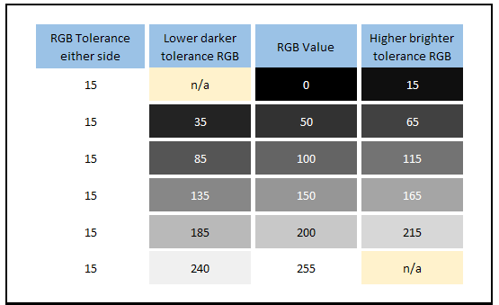
2) 15 to 20 RGB value tolerance
We did the same again, but this time we started at a tolerance of +/- 15 away from RGB 0, and worked up a little from there. This helped a bit at the bottom end to avoid some of the measurement inaccuracies and challenges in tones very close to black. We increased that RGB value again as we reached in to lighter shades and so at RGB 255 we had a 20 tolerance. This was a less strict tolerance threshold of RGB values but visually the shades all looked fairly close to their targets still in the darker tones. In the lighter shades this was getting a little too far away from the “close enough” level with 235 being a bit too far away from 255 for instance, and the shades either side of 200 were a little far away visually. Allowing for an RGB tolerance as high as 20 in the lighter shades seemed too relaxed we felt.
3) Fixed 15 RGB value tolerance for all shades
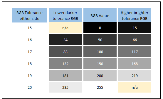
What about if we just stuck to a 15 RGB tolerance all the time? This makes things simpler and easier to understand overall when you have the same fixed value. Visually this was better than the 15 – 20 range in option 2 that stretched too far away from the desired shades we felt in brighter shades, but was it a bit too relaxed still? In darker shades the 15 tolerance still perceptually looked very close to RGB 0 and was a good starting tolerance, it would also help avoid issues with measurement close to black and instrument noise, particularly on panels with poorer black depth capabilities.
For our measurement sample of 30 transitions we measure if we converted this RGB 15 tolerance value in to an average % allowance, it would be 17% on average. That felt like it was a little too generous, despite the visual closeness of the RGB shades in our tests. We felt we could do a little better to tighten this up and bring the shades even closer visually to their targets.
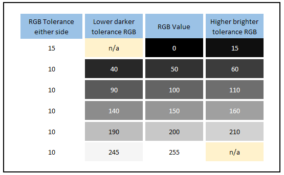
4) Fixed 10 RGB value tolerance for all shades (with small leeway from black RGB 0)
A summary so far then of the options we tested using RGB values instead of a percentage tolerance level:
- 10 – 15 RGB value range left us with limitations at the dark end and led to measurement issues. It also made life complicated and confusing having a sliding scale of RGB values.
- 15 – 20 RGB value range to try and overcome the dark end limitations worked nicely in dark shades, but in the brighter shades ranging up to 20 RGB values was too much and wasn’t close enough visually. Again it was unnecessarily complicated having a sliding scale, a fixed value seemed a better choice.
- A fixed RGB 15 value was tested, sorting out the black level limitations and bringing the brighter tones back in line. Visually it was close but we felt that we could make this a little better and bring the values closer to the target shade.
What we ended up with for our preferred approach was a fixed RGB 10 value for tolerance as shown above. Visually these shades were even closer to the target RGB and so that helped tighten the measure up a little more. We stuck with an RGB 10 tolerance at all levels, except right at the bottom end where we know RGB 10 was too close to the noise floor and led to instrument accuracy complications. We allowed a bit of wiggle room at the bottom end and an RGB 15 tolerance away from black to compensate. This final option was the best of the above choices, being visually very close to the target shades, while also allowing a small compensation in the darkest tones near black.
Issues with using an RGB value tolerance
We’ve already talked about why using a percentage tolerance is not ideal, as it leads to variation in the actual RGB value you’re using depending on the “distance” or range of the transition. Using a defined RGB value threshold isn’t without its own challenges though; sadly there’s no perfect way to do this. We will talk through these limitations as well before taking some measurements with each method and explaining where we have ended up after all this experimenting and analysis.
When defining an RGB tolerance value you can come in to difficulty for transitions with a short distance. For instance with our 15 RGB value tolerance above in step 3, if you’re measuring the 150 > 200 pixel transition then that total distance for the transition is only 50. The tolerance levels dictate that you measure the response time from RGB 165 to RGB 185 in that instance. That is a much shorter measurement period and represents a much small part of the overall response time curve as shown below:
![]()

Demonstrating a limitation with using a fixed RGB 15 tolerance. We have opted to use RGB 10 to help here
In fact you’re only then measuring 40% of the total transition (20 RGB values out of 50). If you were measuring a transition with a range of only 30 (which we don’t typically) then you couldn’t use these tolerance levels at all as the response time would be 0ms. If the range was less than 30 you’d be in the negative values (and no, before any manufacturers start thinking about it we don’t want to start seeing negative response times specs please!)
This was another reason for making that tolerance a bit stricter and using RGB 10, as it would help capture more of the curve and is visually even closer to the target value. The smallest transition range we measure is 50 RGB values in our testing and so a tolerance of 10 either side isn’t bad. This all started with visual comparisons and the tolerance levels we feel are very fair at RGB 10. But this is one issue with using defined RGB tolerance levels instead of a percentage unfortunately.
If you instead use a percentage tolerance bracket, whether that is 10 – 90%, 3 – 97% or anything else than you know you will always be measuring x% of the overall response time curve. In these examples it would be 80% or 94% of the curve respectively. That might sound like a good thing to always capture a certain portion of the curve, but in our opinion its not necessarily reflective of what you see visually. The whole point of trying to gamma correct the response time figures was to more closely relate the measurements back to visual experience. If you stick with a percentage tolerance in order to always measure a certain portion of the curve then you aren’t really relating it to what you see visually. It felt to us more appropriate to instead define a visual tolerance level in RGB values and measure accordingly. This goes hand in hand more with the rationale for correcting for gamma in the first place we think.
Why not just measure the full response time 0 – 100% you might ask and ignore all this messing around with tolerance levels? As a reminder, this method is designed to allow a small tolerance when transitioning from or to a target RGB value where it is visually very close, or probably in many cases indistinguishable from the target value. It avoids capturing parts of the response time curve that might trend very slowly in the very last few values but that are are meaningless from a visual perspective. It also helps avoid noise in measurements and overcome any minor accuracy challenges in the tail ends of the curves. We need a tolerance level of some sort, the challenge is in choosing what that should be.

We will test what impacts all of these have on measured response times in a moment, but to summarise where we are up to so far:
- Gamma correction of the response times provides a fairer measurements relative to the actual RGB values you want to measure between
- Gamma correction helps provide better and fairer measurements of overshoot
- By using gamma correction for response times and overshoot we can create a better view of response times that are even more reflective of what we see in practice
- We don’t believe we should stick with any percentage tolerance level as it’s variable and isn’t a fair view overall if we are trying to update the measurement method to create results that are more reflective of what we see visually
- We feel that it is better to instead define a sensible and fair RGB tolerance either side of our target RGB value, somewhere around +/- 10 to +/-20 seems visually fair in our opinion after testing. We preferred sticking to a tolerance of +/- 10 at all levels to give what we consider to be the fairest visual “close to” values.
Does Gamma Correcting the Response Times Make Much Difference?
That’s the “theory” of it then. Let’s have a look at what impact that has on the response time measurements you might report from testing a screen. These measurements were all conducted on the LG 38GL950G (a 144Hz refresh rate screen) with all other testing methodology and screen settings kept constant.
Original traditional method (no gamma correction)

Response time measurements taken with the original method, no gamma correction and normal 10 – 90% tolerance levels
This is how the response time performance would look if we used the original standard method without accounting for RGB values and gamma, and sticking to the 10 – 90% variable threshold levels of the linear voltage measurements. Note the pretty consistent G2G figures on rise times and fall times across the board. This will also be representative of how LG and the panel manufacturer LG.Display have measured response times, using the method that has been around for 25 years. 100% of the transitions are within the refresh rate window when measured with this method.
Including gamma correction but with 10 – 90% RGB variable tolerance levels

Response time measurements taken with gamma correction but using the variable 10 – 90% of RGB values tolerance levels
Reminder of actual RGB values being used available here slightly earlier in the article
If we now use gamma correction but still stick with the variable 10 – 90% tolerance levels, this time relative to RGB values and not voltage we get the above. As we’ve said in the previous section using a percentage tolerance creates too much variation in the RGB values you are measuring from and to. Part of the point here is that we are trying to capture the response times based on their visual appearance which is more relatable back to real-life usage and how the screen will appear to the user. If we keep moving the goalposts by using a % tolerance where the RGB values we measure to and from keep changing, we feel this is in contradiction to what we were trying to achieve a bit. We want to move away from this, but we include it here for interest.
You can see that overall there is a small change to the average G2G figure, increasing slightly (slower) from 4.3ms to 5.2ms when we take in to account the gamma correction. The response times that have changed the most in this example are in the first vertical column, where the fall times of various grey shades back to black (RGB 0) are quite a bit slower than the original method. If you look at the 255 > 0 transition for instance this used to be 4.8ms but is now quite a lot slower (relatively) at 8.7ms.
The reason for this increase is that before we were not being strict enough when setting the threshold in the darker tones as we identified in the earlier section. With smaller differences in RGB being visible in darker tones due to the human visual system, we have to move that threshold line much closer to the base line. If you look at the original threshold lines based on 10 – 90% of the voltage in a linear fashion (no gamma correction) it looks like this:
![]()

255 – 0 transition fall time mapped with traditional 10 – 90% linear voltage tolerance levels
In practice what we are seeing using that method is that it gets from RGB 255 (white) on the top line back to RGB 80 after 4.8ms. That would be 90% of the way there if we used the linear voltage tolerance. But as we saw earlier in this article that is visually still quite a lot different to where it should be at RGB 25, that being the true 90% way there towards black RGB 0. But if you account for gamma correction then the threshold lines should look like the below:
![]()

255 – 0 transition fall time mapped with gamma corrected 10 – 90% tolerance levels
You can see that the reason for the higher response time in the gamma corrected measurements here is because it now captures more of that “tailing off” part of the line where it gets to RGB 0 (black), whereas this was ignored before. To get all the way to RGB 25 takes 8.7ms instead. That is then visually within 10% of the desired final value of RGB 0 (black). The same thing can be said for the other transitions back to black, they are slower than the original testing method suggests, as long as you consider the actual perceived RGB values and avoid the pitfalls of using the voltage measurements on the graph.
One interesting observation from all this testing is that manufacturers probably need to work on the fall times of pixel transitions more if they can. Measuring using the old method paints a much better picture than if you account for gamma and so has probably led to some “joint deception” across the industry, believing that these fall times were faster than maybe they really are. If gamma is accounted for we can get a better view of these measurements and hopefully display manufacturers can act on these findings and help improve the response times further. This will help improve motion performance of future screens.
Including gamma correction and with 10 – 15 RGB value tolerance levels


We then wanted to remove the somewhat flawed 10 – 90% tolerance levels which are variable depending on the distance of the transition. This change means we will always be measuring to the same RGB value regardless of that distance. As explained in the last section we first of all tried this with a fixed RGB value of 10 away from black, and increased this value a little as we got up to 255 where we used a tolerance of 15. This was our attempt to account a little for gamma again, but use fixed RGB values instead of the variable % that we know caused problems. This is better than using a percentage which leads to variation in the RGB values you are measuring to.
You can see that overall response time figures improved slightly relative to the 10 – 90% threshold measurements, now at 5.0ms G2G overall instead of 5.2ms G2G. The problem with this section though is that a value of 10 as a tolerance away from black is too strict in our opinion at the dark end. In measurements it also has issues with noise and detection with the photosensor, and it’s just too close to RGB 0 really. This can also create problems with measurements and noise a bit more on IPS and TN Film panels where black depth is not as good as a VA or OLED panel. Regardless of the panel technology though we felt a 10 tolerance away from black was visually too close and unnecessarily strict (see the table on the right for visual representation), and was just causing problems and noise with measurements as well. Some of the fall time measurements were unfairly slow in the table above and not really reflective of real-life we felt. So using a tolerance of 10 away from RGB 0 was too prone to error and was too strict. We loosened this up a bit in the next option.
Including gamma correction and with 15 – 20 RGB value tolerance levels

To overcome this issue at the dark end we took more measurements being a little less strict, using a tolerance of 15 away from RGB 0 and working upwards to 20 at the top end away from RGB 255. This reduced the overall response time figure quite considerably now, down from 5.0ms G2G when using an RGB 10 – 15 tolerance range, to 4.0ms G2G when using an RGB 15 – 20 tolerance range. This more relaxed threshold was definitely better at the darker end, being still very close visually to the target (see the comparison table on the right) but also now helping remove some of the noise and challenges with measuring very close to black. Our only issue with this tolerance level was that at the upper end near white, we felt a 20 tolerance was too far away visually.
Including gamma correction and with a fixed 15 RGB value tolerance level


If we stick to a fixed RGB 15 tolerance at all shades then visually this is better than option 2 above, while still being appropriate in the darker shades near black. The results of this particular screen (LG 38GL950G) actually matched the average G2G figure from the old method exactly, but we did feel that RGB 15 was perhaps a little too generous and we wanted to move to something a bit tighter.
Including gamma correction and with a fixed 10 RGB value tolerance level (with small leeway at RGB 0)


So what we settled on in the end for what we consider to be a fair RGB tolerance at all grey scales was a value of 10. We allowed a small 5 RGB wiggle room at the bottom end near black. This was a sensible tolerance at the bottom end away from black, visually still very close to the target and helping to remove the noise and tiny variations we see in measurement in the darkest shades. This also helps keep things consistent on different panel technologies at the darker end. We stuck with the very close RGB 10 tolerance everywhere else which was very close to the target shades. Have a look at the small table on the right (click for a larger version) for a reminder of the actual perceived RGB values we are using there.
You might notice that in the instance of the LG 38GL950G the average G2G figure remains quite close to the old method, with a 0.9ms G2G overall difference (4.3 ms using old method vs 5.2 ms here). This may vary on other screens, but we expect this to mean that if you consider only the average G2G figures between our future reviews using this new method and our older reviews, they should remain pretty comparable. That’s useful as it allows results to be comparable between different screens and between old and new method to a degree as well. The figures on their own are fine, but there’s a lot more context and value in them if they can be compared with other screens and you can identify if one is faster than another for instance.
We should point out that this was not a pre-requisite for determining the tolerance values, we set those based on visual tests of RGB shade patches before we took any measurements. Part of the point of this whole change to gamma correcting response times is that it is supposed to more closely represent what the user will see visually in practice, so we started there with visual tests to determine what was a “close enough” and fair tolerance level for each shade.
Are these corrections worth the effort then? Even a5hun’s original video only went as far as to say that the traditional linear interpretation of 10 – 90% was “moderately deceptive”. You can see that the balance of response times has certainly changed. Using the old method all the transitions were a lot more similar to one another. Here with the gamma correction we can see that the transitions back to black were a fair bit slower and not as fast as many other transitions. We can see that actually some of the transitions were reaching very close to the advertised 1ms G2G response time spec too (150 > 200) when we measure based on fair RGB tolerance levels and avoid using the linear voltage measurements we had in the past. At the end of the day we of course want to be as accurate as possible, while still making the testing sensible and the results easy for our readers to interpret. We think that this change is worthwhile adopting for improved accuracy, and we will talk about how we are updating our testing methodology in a moment.
The Impact of Gamma Correction on Overshoot Measurements
We can also look at the impact the gamma correction has on overshoot measurement. This was performed on the same screen (the LG 38GL950G) but in the ‘Faster’ response time mode where overshoot was extremely high, and very noticeable in practice. This allowed us to do a better comparison of the difference gamma correction makes. Note that for overshoot we have the same issue when using a percentage as we’ve discussed above, we will explain.


On the left are the results if we used the traditional method, working out a percentage overshoot based on the linear voltage measurement on the graph. This is how overshoot has been measured and recorded for a long time by nearly everyone. On the right we can also do the same thing but this time rather than using the % shown on the graph (voltage), we calculate what RGB value it is overshooting to, and then work that out as a percentage beyond the intended transition range.
You can see that switching to considering RGB values instead of voltage the overall view is quite similar – lots of red and some major overshoot! But if you compare the measurements on certain transitions you can see the difference that gamma correction has made. For instance on 0 > 100 (black to middle grey) we had a 102% overshoot before if we consider the voltage linear scale only. That response time graph looks like the following:

So you can see on this voltage linear scale the overshoot peak is the same height as the two green lines are apart (hence the 102% overshoot measurement). If you gamma correct this back to actual RGB values being shown, it is not nearly as drastic, being “only” 37%. Again still far too high and very noticeable, but not as drastic as a figure. That is because the actual RGB values are as below:

You can see similar adjustments on other rise times, where they’ve dropped quite considerably in many places. You can also see that on the fall times (lower left portion of the table) it has increased in a few places as before it was being under-reported. Overall this gives a more complete and accurate view of the actual overshoot for each transition, relative to perceived RGB values and accounting for gamma.
Moving Away from a Percentage for Overshoot
However, you may have noticed that we have the same challenges we did before when we were looking at using a percentage for our response time tolerance levels. If you stick to using a percentage for overshoot, even after gamma correction, it is influenced again by the range/distance of the transition. For instance if you measure 0 > 50 and the RGB value overshoots by 15 to reach RGB 65 that would be a 30% overshoot as a percentage. If you were measuring 0 > 200 and it overshoots by the same 15 RGB values to reach 215 that would make it only a 7.5% overshoot as a percentage. So even though in both cases the shade is overshooting by the same 15 RGB values, the percentage recorded changes massively. For this reason we need to also abandon the use of a percentage for overshoot as it is not providing a fair or consistent representation of the results.
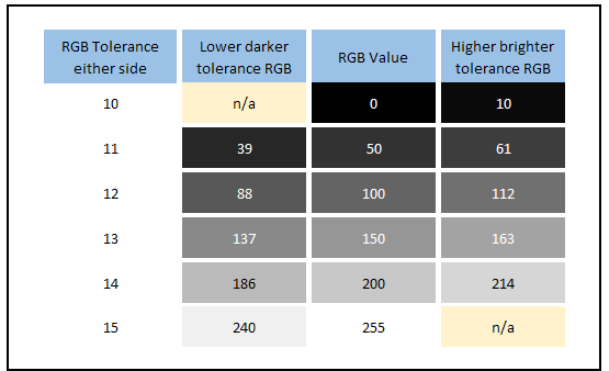
We will instead therefore switch to a fixed RGB overshoot scale, just like we have when defining the tolerance levels for measuring response times. Through our testing we have decided to use a fixed RGB scale where anything <10 is largely ok when it comes to overshoot. By RGB 15 it is starting to become distracting but anything >20 is unacceptable and very noticeable. This might sound a bit strict given the RGB tolerance levels we discussed before, but these changes in brightness levels for overshoot are far more noticeable in practice.
Here is an indication of what an RGB 5 to RGB 20 difference makes visually to a couple of example shades for the consideration of overshoot:

So now we will measure how far the transition overshoots as a fixed RGB value and plot that accordingly. This is no longer a percentage but an RGB overshoot value, colour coded as per the scale we’ve just described. For our example of the LG 38GL950G in faster mode we compared above, this is what the overshoot would look like now, compared with the gamma corrected overshoot as a percentage:
LG 38GL950G – Faster Mode


We also took some measurements of the LG 38GL950G in the ‘fast’ mode where there is no visible overshoot. This is how the results compare:
LG 38GL950G – Fast Mode


You can see that the transition from 150 > 200 was originally rated as red at 20.6% when using the old voltage overshoot measurement. Even with gamma correction when you consider it as a percentage that’s still 16%. In reality it’s only overshooting by 8 RGB values which is very low and perceptually hard to see, so the resulting green rating is a lot more fair.
We also took some measurements of the recently tested Acer Nitro VG280K since we had it available, a 60Hz model set in the ‘extreme’ mode where there was visible overshoot.
Acer Nitro VG280K – Extreme Mode


We should reiterate again that this won’t change the overall rating of the screen which takes in to account visual performance too, but if you are looking at different transitions and want a more accurate results then using gamma correction is a great start, but also switching to a fixed RGB overshoot scale also helps significantly. Results are much fairer and reflective of what you would see in real use.
The Impact of Other Gamma Modes

Without wanting to make this any more complicated we should note that these response times are being corrected relative to the most commonly used and recommended gamma curve for a display, that being 2.2 (or sRGB which is extremely close to 2.2). If you choose to run a display in any other gamma mode, which perhaps you might consider for certain games for instance, then this does have a small knock on impact to the response time results. It’s not worth going in to loads of testing and data here but just keep in mind that the results are being corrected to 2.2 gamma for the purposes of giving a more accurate overall view of the response times, relative to the actual grey values you will see with the human eye. If you choose to use other gamma modes, or things like Black Equalizer type technologies that adjust the gamma curve in dark areas then it will have a small impact to the actual response time figures, but in practice it shouldn’t represent any real difference at all as the differences are minor. The more obvious change of course will be in the overall appearance of the screen in dark and light shades with a different gamma curve being used.
Before we get on to how we plan to account for this we wanted to also talk about…
A Tighter Tolerance and Capturing the “Total Response Time”?

Thumbnail image taken from the Hardware Unboxed YouTube video where they talk about their updated testing methodology
The guys over at Hardware Unboxed (an excellent YouTube channel for more reviews) have also created a great video recently about this whole topic, well worth a watch too if you want more information. As well as adopting the gamma correction for response times and overshoot as we’ve described above, they have also tightened up the tolerance levels to use 3 – 97% instead of the old 10 – 90%.
We’ve touched on the challenges with using a percentage in that way above as this creates variable RGB values you are measuring from and to, depending on the distance between the two shades. These differences in RGB values aren’t so drastic when you are using 3 – 97% but it’s still there as a potential problem and variance. The gamma correction of the response times doesn’t matter as much, as really you’re just capturing nearly the whole range anyway once you’ve allowed a very small portion to avoid noise and errors. What they’re really trying to do here with moving to 3 – 97% is capture pretty much the whole transition time – or the “total response time” as you might call it.
Let’s consider the argument for being more strict a bit further and work out what it would be if we used RGB values instead of a percentage. A 3 – 97% tolerance level means that for the 0 > 255 transition you are measuring from RGB 8 to RGB 247. That’s very strict at both ends visually. If it’s a measurement of the transition 100 > 200 though for instance, the 3 – 97% would give you from RGB 103 to RGB 197 which is even more strict. That’s the problem again of the variable % as it’s not always the same RGB values as we discussed earlier. Less drastic than if you use variable 10 – 90% but still there. As we said, you’re basically capturing the whole response time curve here anyway with 3 – 97% so the main change Hardware Unboxed have made is to move to measuring the “total response time” really.
We settled earlier on a fixed RGB 10 tolerance for all shades which we felt was visually very close to the targets. We did experiment with closer RGB values but we felt that perceptually an RGB 10 tolerance was appropriate and sensible. The alternative to using the 3 – 97% discussed here would be to use a stricter RGB shade tolerance. If we worked out the average RGB value that would be applicable for our measurement set using the equivalent of the 3 – 97% threshold then it would be an RGB tolerance of 3.5 (rounded to 4) either side of the shade. If we were aiming to capture the total response time this would be fine, but we are still wanting to have a reasonable tolerance level included in the measurements here, just with an RGB value instead of a variable percentage.
Each reviewer is of course entitled to their own preference here and there’s probably not a right or wrong way to do this. Using a tighter tolerance is certainly an option to consider, as is sticking to a percentage instead of fixed values. By changing to a 3 – 97 % threshold one significant impact here is that in Hardware Unboxed have added further time on to their response time measurements and results. This can commonly be as much as 2 – 3ms, sometimes even higher. It can lead to a increase in the response time figure anywhere from around 30% to 100% compared with the old method.
So should we consider doing the same for our future testing? In our opinion, changing to something like 5 – 95%, 3 – 97% or certainly to 0 – 100% is too strict and doesn’t necessarily translate back in to real-life perceived experience any better than the older 10 – 90% thresholds (if you use RGB values once gamma corrected) or a less strict fixed RGB tolerance number like 10 that we have decided to use. Yes, 3 – 97% might provide a more precise measurement of the “total response time” in strict terms if we are talking about how long it takes that pixel to change fully from one shade to another. But we need to ask ourselves whether that is a help or a hindrance to what we are trying to quantify with the measurements?

If we compare the thresholds above, is using a tighter 3 – 97% threshold really that much better than using something like our proposed RGB 10 tolerance visually? In our opinion perceptually it offers little benefit. The RGB 10 tolerance is still very close to the actual shades.
Helping to Keep Data Comparative

The other aspect of all this is that by defining a reasonable fixed RGB tolerance of something like 10 as we landed on earlier, we have inadvertently ended up with an average G2G figure in our testing that is fairly close to the old traditional (but somewhat flawed) measurement method. In the same ball park at least. The figures of different transitions have changed and the balance of the rise and fall times has too, but the average remains close. This proximity of the average G2G figure will likely vary from one screen to another, it will be interesting for us to compare the new method vs old method in future testing to see. But the good thing about these figures being similar is that we can still lean on old measurement data reasonably well.
We didn’t set out for this to happen and it was not a pre-requisite for where we ended up. We were comfortable that correcting the measurements to account for gamma would provide a better and more accurate view overall of the different transitions and a better reflection of how the screen would look visually to the user. Before we took any measurements we considered the problems with percentage tolerance levels first and then decided to define various fixed RGB values that we experimented with visually. This felt like the most appropriate way to define the tolerance levels and keep things fair. Given the whole point of gamma correcting the response times in the first place was to relate them back to what we see visually in a better way, measuring to and from suitable RGB values seemed a better fit. While the results varied in places, the fact that the average G2G figure is in the same ball park was an added bonus as it helps keep results comparative.
The old measurement method and the 10 – 90% threshold used there has been around since the first LCD panels were produced in the mid 1990’s and has been the standard for panel manufacturers, display manufacturers and all independent third parties like display reviewers since. Pretty much all measurements have been taken in the same standard way and so when you compare measurements between different screens you can make a direct comparison. Switching to gamma corrected response times can provide a more accurate measurement that is more reflective of real-word thresholds in RGB. But we don’t feel there is any real cause to make the thresholds more strict than we have defined earlier when it has a significant knock on impact to the figures captured.
The old method and its associated 10 – 90% tolerance has been the standard for so long that the whole market is used to understanding what any measured response time figure should approximately represent in practice and in user experience. For example you can see a 5ms G2G average response time and understand where it would sit relative to a 12ms G2G figure.
If you change the threshold now to something more strict like 3 – 97%, or instead go even more extreme like 0 – 100% and start trying to measure the total response time, you undo more than 25 years’ worth of understanding and comparative data. All future response time figures will now be higher (i.e. slower) than everything that came before it because you are increasing the strictness of the thresholds. Suddenly a screen that would previously have been rated at 5ms might now be 8ms. You can no longer compare all the results and displays unless you go back and re-measure every single display to move them in to the new format. We’ve measured more than 140 displays with the same method over the last 8 years, it isn’t possible to re-measure those to move them in to a new format with different thresholds.
And even if you do, part of the beauty of the old reasonable tolerance levels from the 10 – 90% standard being in place for so long is that pretty much everyone has used it, and so you can also generally compare results between different reviewers quite nicely. To make a change useful to the market, everyone really needs to do the same thing.
This is not meant as a criticism of anyone who might choose to tighten that threshold, but in our opinion it creates a more complicated market for your average consumer. They can no longer compare results between different reviewers if they are all using different criteria. One reviewers 5ms G2G screen might be another reviewers 8ms G2G screen for instance. We are not saying that there are no grounds to tighten up the thresholds a bit though in the interest of providing more precise or complete measurements. But we don’t personally feel that this visually provides any real benefit or helps the consumer, it just makes life more difficult.
Having said that, to help overcome this a bit from our side of things we will discuss the changes we are making to our review process.
How We Are Adjusting and Improving Our Testing
Hopefully you’ve followed this article ok and it’s not gotten too technical or confusing. We are always looking for ways to improve our testing methodology and accuracy of our results and we are grateful to the work, analysis and later discussions with a5hun and Hardware Unboxed that triggered a lot of the thinking and testing for this article. We are now planning to make some changes to our future reviews to help capture an even better view of a screen’s performance and gaming quality.
1. We will be changing to measure gamma corrected response times

Example of response time data table presentation – to feature gamma corrected response times in the future
Gamma correction of response times certainly makes sense and correcting to a gamma of 2.2 will ensure a fairer and better reflection of real-life colour and grey scale changes, and remove any errors when gamma is not accounted for previously. Response time tables and summaries will continue to look largely the same in our reviews, but we will use the more accurate gamma corrected figures. This will help identify any issues with certain transitions, and help ensure we provide a fair reflection of response time performance while refresh rates continue to increase in the market. It will also help us continue to hold display manufacturers accountable for their specs and performance.
2. We will be sticking to what we consider a fair and reasonable tolerance level for measurements, but switching to a fixed RGB 10 value and away from using percentages
We will move away from using a percentage tolerance which is variable depending on the transition “distance” and makes life complicated. If we’re going to be more precise with gamma correcting the figures, we should also ensure consistency with the tolerance levels. We feel that an RGB 10 tolerance is appropriate and very reasonable and is perceptually very close to the target shade. We allow a small amount of leeway near black and use RGB 15 there and this has the advantage of avoiding noise and measurement accuracy errors in the darkest tones, and also helps account for different panel technologies better.
By sticking to these reasonable tolerance levels of RGB 10 and not going too strict or trying to measure the full transition, it also has the added unexpected benefit of producing an average view that is close to what the old method produced, meaning that we do not need to undo 25 years’ worth of understanding about response time figures and what they represent in the market. Nor do we need to create a situation where all our results are no longer comparable to one another top level.
We will not be fundamentally changing the tolerance thresholds for measuring response times to be more strict than this as we do not feel this provides any real benefit or any more accurate representation of performance. Note that the threshold levels have no bearing on overshoot data at all, only response times. But…
3. We will add in a ‘Total Response Time’ average to our summary tables

Having said that, to help create a situation where our results can also be easily compared with reviewers who might use different threshold levels, we will also provide an average G2G figure for a “total response time” that is representative of a tighter 3 – 97% threshold. So for those who might want to be super-strict with the measurements and figures, that will also be useful. An average G2G figure in the summary table for this we feel will be adequate for most readers as quick reference and for comparison purposes and it will be included as shown above.
This 3 – 97% threshold matches the method Hardware Unboxed are now using for their reviews so this should help when comparing results between our different reviews. Why not the full 0 – 100% then? We feel that the 3 – 97% should be very close to the real-world full response time, and removes issues with noise and errors particularly problematic in darker tones. For all intents and purposes 3 – 97% and our new “Total response time” stat should be a good representation of the full transition being completed.
4. We will include ‘legacy’ measurements in the short term

In the short term we will also include an average G2G figure from the old ‘legacy’ method for response times taken without any gamma correction. This will be useful if you want to compare a new review to an older one. Since we have tested all previous screens for the last 8 years without gamma correction it will be useful to continue to provide that view moving forward as well, so you can fairly compare two screens. As we test more screens with gamma correction in the future we will be able to phase out this legacy measurement.
5. We will gamma correct overshoot and switch from using a percentage to using a fixed RGB scale

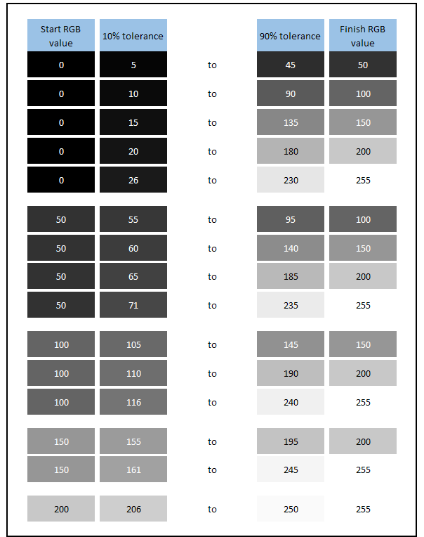
In order to more accurately present overshoot data that is reflective of what you will see in practice we will gamma correct the measurements and consider actual RGB overshoot as opposed to the traditional voltage measurement on the graph. We will also move away from defining this as a percentage which leads to significant errors in the calculations depending on the range/distance of the transition. We have instead defined a fixed RGB overshoot value scale as shown above. So the table will now show how many RGB values the transition overshoots by. For the colour coding: up to a difference of 10 RGB values is generally fine and hard to see. By the time you reach a 15 RGB difference it becomes quite noticeable, and anything that is 20 or more is distracting and problematic.
6. We will add in a few new data points to the tables for overshoot analysis

Example of the updated overshoot analysis data to be presented in future reviews
As well as being updated to included gamma correction of the overshoot and switching to a fixed RGB value scale, we will provide a more detailed breakdown of the overshoot performance in the summary table for simple analysis and more insight. This will include a measure of how many of the transitions have an overshoot equal to or more than 15 RGB (where it becomes very noticeable in practice). Also this is then split in to rise times and fall times as that influences whether the overshoot appears as pale or dark halos, again with a measure of how many transitions are particularly problematic. This will give you a good indication of whether you can expect visible overshoot in practice, and if so how it will look. We will continue to give the screen a colour-coded overall response time rating as well.
7. We will continue to provide pursuit camera photos to capture real-life motion clarity

Example of pursuit camera photos for visual representation of real-life perceived motion clarity
Response time and overshoot quantitative measurements are all very well, but this needs to translate back in to real life experience. We will continue to provide pursuit camera photos that capture real-life perceived motion clarity in relevant modes and settings. This might include at different overdrive settings (like the example above), at different refresh rates and with blur reduction modes enabled. Combined with the more accurate response time and overshoot measurements, and new data points, this should give a really good overall view of how a screen performs.
Conclusion and TL;DR
We should start by recognising the great work that was done by a5hun on his growing YouTube channel. His video goes in to lots of detail about this matter and was the primary reason behind this article and our subsequent testing and analysis. Our thanks also for his input and discussion on this topic in recent weeks.
There’s a lot to take in with this article and we hope that it’s made sense as much as possible. For those who want to jump straight to the conclusion we have provided a summary below:
- Traditional methods for measuring response times on displays that the whole industry has used for over 25 years are a little flawed in their method
- They have always measured a reasonable 10 – 90% tolerance level when measuring the pixel transition grey shade change. However, this threshold is based on a linear voltage scale in the data and does not account for the display’s gamma or how the human eye sees different grey shades
- In fact these measurements are a little misleading when you consider the grey shade you are trying to reach vs. the actual grey shade that is measuring to. This is particularly problematic in darker shades
- It also leads to errors with overshoot % calculations, generally over-exaggerating the figure on rise times, and under-calling the figure on fall times
- We can “gamma correct” the response times in our testing which provides fairer measurements relative to the actual RGB values you want to measure between. This helps give a better view of the response time performance overall
- This same gamma correction helps provide better and fairer measurements of overshoot as well
- By using gamma correction for response times and overshoot we can create a better view of response times that are even more reflective of what we see in practice
- In doing this gamma correction we also need to move away from using generic percentage threshold levels. We cannot stick with any percentage tolerance level as it’s variable and isn’t a fair view overall – so we need to move away from using 10 – 90% levels
- We need to instead define a sensible and fair RGB tolerance either side of our target RGB value, somewhere around +/- 10 to +/-20 seems visually fair in our opinion. We preferred sticking to a tolerance of +/- RGB 10 to give what we consider to be the fairest visual “close to” values.
- We also need to reconsider how we present overshoot, gamma correcting the measurements but also moving away from using a percentage value which is variable and instead defining a fixed RGB value scale.
- The gamma correction doesn’t make a huge difference to our overall view of the screen or the average G2G figure obtained. It should also not impact the general overshoot rating awarded using the old method. It will however provide a more complete and accurate view overall
- We have made some updates and improvements to how we will measure response times and gaming performance in the future
- Thankfully with the overall results remaining fairly close this does not undo all those year’s worth of testing using the old method, and results can still be compared pretty well between screens. The understanding of what each response time figure means in the market is largely unchanged
- We have considered moving to an even tighter measurement tolerance but we do not feel that this offers any visual benefit or fairer reflection of real-life experience, and just leads to difficulties in the measurement data and impacts the industries existing data which is then hard to compare
- We will however include a figure in our results representing this “total response time” and also an old “legacy method” figure to help with comparisons between old and new reviews, and between our site and other review sites.
Further reading – if you’re after a gaming screen you should check the TFTCentral Recommendations List for Gaming Monitors
 | If you appreciate the article and enjoy reading and like our work, we would welcome a donation to the site to help us continue to make quality and detailed reviews and articles for you. |